
Analyzing the Economic Cycle: A Framework for Macro Regime Identification
A qualitative four-axis grid to characterize a macroeconomic regime without trying to date it or anticipate its reversal. Designed for ambiguous phases when conventional signals contradict each other.
Operational application page for the tool. For the wider context, see the analysis tools hub.
- 1. The recurring illusion of cyclical positioning
- 2. Four axes to characterize a regime
- 3. Axis 1 — Real activity dynamics
- 4. Axis 2 — State of financial conditions
- 5. Axis 3 — Behavioral dynamics of agents
- 6. Axis 4 — Underlying fragilities
- 7. Cross-axis reading: convergence or divergence
- 8. Typical historical configurations
- 9. Common application mistakes
- 10. Scope and limits
- 11. Further reading
1. The recurring illusion of cyclical positioning
Economies never shift abruptly from one phase to another. Transitions unfold gradually, spread asymmetrically across sectors, and remain undetectable for long periods in aggregate statistics. The reductive lens opposing expansion and contraction generally obscures the zones of vulnerability that form in between.
The most frequent illusion consists in diagnosing a cycle from a single observation axis — often real activity, because it produces the most media-covered indicators (quarterly GDP, monthly employment). This single-source reading systematically leads to underestimating financial imbalances forming in the background and overestimating the robustness of a regime until the revealing shock occurs. The inflation regime itself plays a central role in the formation of these vulnerabilities.
This diagnostic grid addresses this challenge by imposing four simultaneous observation axes, whose cross-reading constitutes the added value. The objective is neither to date a cycle precisely nor to anticipate a reversal, but to structure the reading of uncertain phases and to identify configurations of contradictory signals that characterize transitions.
2. Four axes to characterize a regime
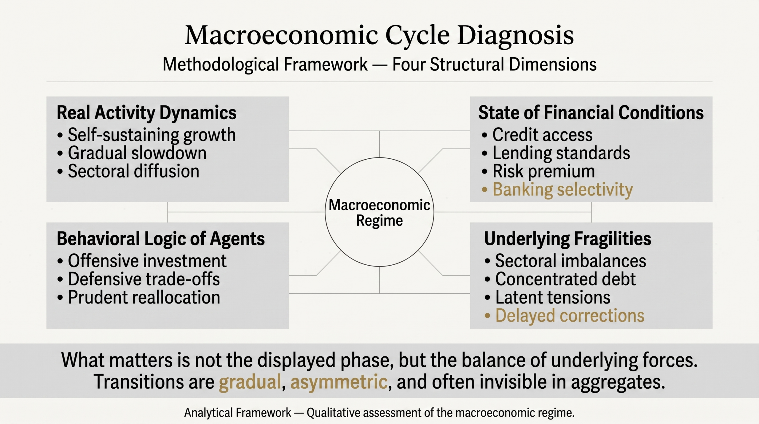
The four axes are not hierarchized: none is judged a priori more important than another. Their strength comes from their complementarity. A coherent regime displays convergent signals on the four axes; a transition regime is recognized by systematic divergence between some of them.
Each mobilizes distinct variables, operates on its own timescales, and presents specific reading biases. The following sections detail these characteristics. When Axis 2 (financial conditions) is central to the analysis, the interest rate cycle reading tool provides its fine-grained decomposition through the three dimensions of variation, persistence, and transmission.
3. Axis 1 — Real activity dynamics
This axis examines the forces driving the economy beyond immediate conjunctural fluctuations. It helps distinguish self-sustaining growth from a controlled slowdown or a structural drag spreading quietly.
Variables mobilized: GDP growth and its components (FRED GDPC1, PCE consumption, GPDIC1 productive investment, net exports), industrial production (INDPRO), non-farm payrolls (PAYEMS) and their sectoral composition, job openings (JOLTS — JTSJOL), initial jobless claims (ICSA), retail sales (RSAFS), leading activity surveys (ISM manufacturing and services).
Analytical reading: the distinction between leading, coincident, and lagging indicators is central on this axis. PMI surveys and building permits signal inflections several months before GDP or employment record them. Conversely, the unemployment rate is a lagging indicator: it continues falling several months after activity turns, because firms adjust headcount with delay. This structural lag is the dominant pattern identified by the misleading indicator tool (Latency pattern).
The cycle of monetary policy decisions that partly structures activity dynamics is documented in the Fed Funds decisions track-record since 1954, a useful base for placing the current phase in long historical series.
Reading bias to avoid: concluding to activity robustness on the basis of lagging indicators (unemployment, core inflation) when leading indicators have already shifted is the classic end-of-cycle error. In the United States, unemployment reached its historical low in the six months preceding each of the 2001 and 2008 recessions (FRED UNRATE series, NBER dating).
4. Axis 2 — State of financial conditions
Financing conditions determine access to funding, the stringency of lenders, and the collective appetite for risk. They may appear flexible in aggregate while tightening insidiously for certain borrower profiles.
Variables mobilized: composite financial conditions indices (NFCI Chicago Fed, ANFCI adjusted), corporate credit spreads (high yield BAMLH0A0HYM2, investment grade BAMLC0A0CM), long-term real rates (FRED DFII10 for 10-year TIPS), Shiller CAPE ratio, mortgage rates (MORTGAGE30US), bank lending standards (Senior Loan Officer Opinion Survey of the Fed, Bank Lending Survey of the ECB), central bank aggregate balance sheets.
Fine reading of this axis mobilizes the three-dimensional grid of the interest rate cycle tool: variation (policy rate trajectory), persistence (duration in restrictive or accommodative territory), transmission (deployment through the five channels of credit, corporate balance sheets, real estate, exchange rate, and expectations).
The cost of capital in real terms and its interaction with equity valuations is documented in the real interest rates and CAPE ratio study, covering the historical relationship between the two variables over more than five decades.
Analytical reading: the aggregate (NFCI) does not say everything. A weighted average can mask divergence across segments — for example, compressed investment grade spreads while high yield widens, or abundant dollar liquidity while offshore funding tightens. The useful reading examines intra-segment dispersion, not just the average. This mechanism corresponds exactly to the Hidden Concentration pattern described in the misleading indicator tool.
Reading bias to avoid: concluding to easy financial conditions on the basis of crushed VIX and tight investment grade spreads amounts to projecting an average onto heterogeneous situations. Volatility compression at the top of a financial cycle is itself a documented fragility signal (typical case: VIX below 15 on average in 2007). Related data: Our VIX index data.
5. Axis 3 — Behavioral dynamics of agents
This dimension examines the strategic choices of households, firms, and financial institutions. It reveals a possible shift from an offensive stance (borrowing, investment, risk allocation) toward reallocation or defensive retreat.
Variables mobilized: household savings rate (FRED PSAVERT), outstanding corporate credit and growth (BUSLOANS), private productive investment (GPDIC1), share buybacks and dividends (S&P 500 buybacks via Standard & Poor’s), confidence surveys (University of Michigan UMCSENT, Conference Board), speculators’ positions on futures (CFTC COT reports), net flows on equity vs bond vs cash ETFs.
Analytical reading: behaviors rarely shift in synchrony. A household confidence survey may remain elevated while savings behaviors already reveal a change (rising savings rate, lengthening repayment durations, falling durable goods purchases). Divergence between stated and behavioral indicators is an early signal.
On corporations, share buybacks and productive investment often move in opposite directions: a cycle of massive buybacks without corresponding productive investment may signal a preference for short-term optimization over organic growth, a reading documented in the corporate finance literature since Jensen.
Reading bias to avoid: interpreting a confidence survey as a standalone signal, without cross-checking with behavioral data. In the US as in the euro area, confidence indices have regularly decoupled several months after savings and credit behaviors began to change (FRED UMCSENT vs PSAVERT series, ECB consumer confidence vs household credit growth).
6. Axis 4 — Underlying fragilities
Macroeconomic imbalances almost never emerge uniformly. They first crystallize in localized pockets — a sector, a borrower category, a geographic area, a market segment — before contaminating the whole system, without global indicators necessarily issuing an early warning.
Variables mobilized: high yield spreads and their sectoral composition (FRED BAMLH0A0HYM2 and sectoral breakdowns), corporate default rates (Moody’s, S&P), leverage ratios of non-financial corporations (Fed Z.1 Financial Accounts), commercial real estate exposures of regional banks, outstanding and quality of subprime loans (auto, real estate, student), volumes and duration of bond portfolios held in held-to-maturity by banks, emerging sovereign debt denominated in hard currency (BIS Triennial Central Bank Survey). On the same theme, see our study on how central banks set policy and transmit it to markets.
High yield credit spreads particularly illustrate this phenomenon by signaling imbalances before aggregate indicators react. See the study on HY spreads as a leading indicator for the documented empirical relationship over four decades.
Analytical reading: mapping fragilities requires granular work. An aggregate high yield spread at 400 basis points may mask very different situations by sector: 250 bp for utilities, 700 bp for retail, 1200 bp for energy in the midst of an oil correction. Intra-segment dispersion informs on the nature of the imbalance, not the average. This logic is precisely what the misleading indicator tool identifies as the Hidden Concentration pattern.
Geographic granularity is equally important. The US regional banking crisis of March 2023 (SVB, Signature, First Republic) revealed fragilities concentrated on mid-size bank balance sheets with heavy exposure to commercial real estate and uninsured deposits — a situation undetectable in the national aggregates tracked by standard macro indicators.
Reading bias to avoid: relying on national systemic indicators to assess the resilience of a banking system whose fragilities are sectorally concentrated. Stress tests passing at aggregate level can mask undesirable concentrations on certain banks or exposures.
7. Cross-axis reading: convergence or divergence
The grid’s added value comes from the simultaneous reading of the four axes, not from their separate examination. Two main configurations occur.
Coherent regime. The four axes display convergent signals — for example: robust real activity, easy financial conditions, offensive behaviors, contained fragilities. Or conversely: contracting activity, tight conditions, defensive behaviors, materialized fragilities. In these phases, the reading is relatively straightforward and the diagnosis stable.
Transition regime. The axes diverge. The most instructive configuration combines still-positive real activity (Axis 1) with tightening financial conditions (Axis 2), stable or hesitant behaviors (Axis 3), and fragilities forming locally (Axis 4). This divergence is precisely what standard macro aggregates underestimate, and it structures the best-documented pre-recession phases.
Temporal asymmetry between axes is constant. Financial conditions and fragilities typically shift before real activity and stated behaviors. This sequence does not constitute a predictive rule (lags vary considerably across cycles) but a reading framework that structures the interpretation of mixed signals.
Cyclical transition phases are paradoxically the ones that inspire the most confidence, even though they contain the most marked cross-axis divergences.
8. Typical historical configurations
Three historical configurations illustrate the grid without constituting a predictive template applicable to the present situation.
End of 2006 — mid 2007 in the United States. Robust real activity (GDP growth of 2.7% in 2006, unemployment at 4.4% in March 2007 — NBER and FRED data), apparently easy financial conditions in aggregate (low NFCI, VIX average 12.8 in 2006), offensive behaviors (record share buybacks, elevated corporate leverage), but intense localized fragilities in subprime real estate (defaults rising since late 2006, first specialist bankruptcies in April 2007). Maximum divergence configuration between Axes 1-3 and Axis 4. A case examined in the misleading indicator tool for the Latency (unemployment) and Crystallization (VIX) patterns that characterized common reading at the time.
End of 2018 — early 2019. Solid US real activity (GDP +2.9% in 2018), rapidly tightening financial conditions (NFCI rising since October, HY spreads from 350 to 540 basis points between September and December), stable behaviors, moderate fragilities without major concentration. The configuration justified the Fed reversal in early 2019 (rate hike pause, preventive cuts mid-year), illustrating how a financial conditions reading can lead to rapid recalibration. The Yellen-Powell cycle 2015-2019 is documented in detail in the interest rate cycle tool.
Year 2023 in the United States. Real activity more robust than expected (GDP +2.5% in 2023 versus recession expectations), financial conditions in a prolonged restrictive phase (Fed Funds at 5.25-5.50%, 10-year real rates exceeding 2%), behaviors resilient supported by savings accumulated during the pandemic, fragilities materialized on certain pockets (regional banks in March, commercial real estate over the year). Persistent divergence configuration that invalidated standardized recession models.
These three examples illustrate the diversity of regimes the grid allows to characterize, and the inadequacy of a single signal or aggregate score to distinguish them.
9. Common application mistakes
Applying the grid presents several recurring pitfalls.
- Reducing an axis to a single indicator. The real activity axis does not reduce to quarterly GDP; the financial conditions axis does not reduce to the VIX. Each axis combines several variables, and analysis must reflect this plurality.
- Arbitrarily weighting the axes. The grid remains qualitative: no coefficient hierarchizes the axes a priori. Attempting to produce a composite score by weighting the four axes contradicts the tool’s logic and reproduces the defects of aggregate barometers.
- Conflating leading and coincident signals within the same axis. On the real activity axis, manufacturing PMI and unemployment do not say the same thing at the same moment. Mixing their readings leads to incoherent diagnoses.
- Dating the grid’s application. The tool characterizes a regime, not a turning point. Concluding that “the transition will occur in six months” turns a qualitative framework into a forecasting exercise, which it is not.
- Applying the grid to a geographic area without adapting indicators. Variables relevant for the United States (NFCI, Fed Funds) are not directly transposable to the euro area (where equivalent indicators include ECB surveys and European BLS conditions). The grid is universal, its indicators are local.
Confusing a calm backdrop with a fundamentally strong economy, by relying on lagging indicators and ignoring the cross-axis divergences that characterize transition phases.
10. Scope and limits
This reading grid presents several inherent limits worth making explicit:
- It is not designed to date a cycle. None of the historical configurations detailed above allows establishing a probability or time horizon of reversal applicable to the present situation. The grid characterizes a state, not a trajectory.
- It produces no operational signal. The tool structures an analytical argument; it provides neither allocation recommendation, nor market timing indication, nor ranking of investment opportunities.
- It remains qualitative. The signals mobilized are quantitative (FRED, ECB, BIS series), but their cross-reading falls within informed analytical judgment, not a reproducible algorithm.
- It assumes granular work. Approaching each axis through its single aggregate loses what matters. The grid calls for examination of intra-segment dispersion and localized concentrations.
For the macro series underlying this diagnostic, see the macro-financial indicators & data hub. For the conceptual framework from which the tool derives, see reading economic and financial cycles.
- The grid articulates four simultaneous axes: real activity, financial conditions, agent behaviors, underlying fragilities. None is hierarchized a priori.
- Added value comes from cross-axis reading. A coherent regime displays convergent signals; a transition regime is recognized by persistent divergence between axes.
- Financial conditions and fragilities typically shift before real activity and stated behaviors. This asymmetry is not a predictive rule but a reading structure.
- The tool remains qualitative and produces neither operational signal, nor dating, nor ranking of investment opportunities.
11. Further reading
- Eco3min macroeconomic analysis tools — return to the three-tools hub.
- Interest rate cycle dynamics — Tool 1 provides the fine decomposition of Axis 2 (financial conditions) through the variation × persistence × transmission grid.
- Anatomy of a misleading indicator — Tool 3 is mobilized whenever an axis displays an apparently reassuring signal (Latency, Hidden Concentration, Consensus Crystallization patterns).
- Reading economic and financial cycles — conceptual framework from which the tool derives.
- Macroeconomic analysis methodology — Eco3min data sources and conventions.
- High yield spreads as a leading indicator — empirical study on the underlying fragilities axis.
- Real interest rates and CAPE ratio — empirical study on the financial conditions axis.
- Fed Funds decisions track-record since 1954 — historical base mobilized for the real activity axis.
- Macro-financial indicators & data hub — series mobilized axis by axis.
Last updated — 12 July 2026
Disclaimer – Financial Information: The analyses, commentary, and content published on eco3min.fr are provided for informational and educational purposes only. They do not constitute investment advice or a solicitation to buy or sell financial instruments. Past performance is not indicative of future results. All investment decisions involve risk and are the sole responsibility of the reader.