The Contrarian’s Almanac: Why Buying Fear Has Outperformed Buying Calm by 2-to-1 Since 1990
A daily dataset of 9,126 observations mapping VIX volatility regimes to subsequent S&P 500 returns — revealing that the market’s price for discomfort is systematically too high, and the periods investors fear most have delivered the strongest forward returns.
Eco3min Research · Last updated: · Frequency: Daily · Coverage: Jan 1990 – Mar 2026
The VIX — the CBOE Volatility Index, widely known as the “fear gauge” — is the most recognized measure of expected stock market volatility. Yet its deepest analytical value lies not in what it says about risk, but in what it reveals about compensation. This page provides a complete daily dataset combining VIX levels with forward S&P 500 returns across five volatility regimes, demonstrating that buying equities during periods of elevated fear has produced systematically superior returns since 1990.
TL;DR
Buying the S&P 500 when the VIX exceeds 30 has produced a median 12-month forward return of +22.4% since 1990, compared to +11.3% when the VIX is below 15. At VIX levels above 45, the median 12-month return rises to +30.6% with a 96.4% hit rate. Volatility is not risk — it is the market’s compensation for absorbing discomfort, and that compensation has been systematically excessive.
Latest Observation — March 27, 2026
31.05 VIX Level
93rd Percentile (Since 1990)
Fear Current Regime
−8.7% S&P 500 Drawdown
Key Research Findings
Buying the S&P 500 on days when the VIX closed at or above 30 — the Fear threshold — has produced a median 12-month forward return of +22.4% across 722 observations since 1990, compared to +11.3% when the VIX was below 15. The difference is not a statistical artifact: the Fear regime delivered nearly double the median return of the Complacency regime.
At the most extreme VIX levels — above 45 (the Panic threshold) — the median 12-month forward return rises to +30.6% with a hit rate of 96.4%. Only 4 of 112 Panic-regime observations produced a negative 12-month return. These readings have historically occurred during genuine crises — 2008 GFC, COVID 2020, 2025 tariff shock — when investor sentiment was at its most negative.
The VIX exhibits a systematic premium over realized volatility. As of March 2026, the VIX stands at 31.1 while trailing 20-day realized S&P 500 volatility is approximately 15.0% — a VIX premium of 16 percentage points. This gap — the price investors pay for downside insurance above and beyond actual experienced volatility — has historically represented a transfer of wealth from hedgers to those willing to absorb equity risk during stress.
VIX mean reversion is a structural feature, not a coincidence. Following every episode where the VIX crossed above 30, it has returned to its long-run median (17.6) within a median of 139 trading days — approximately 6.6 months. No VIX spike above 30 in the 36-year dataset has failed to revert.
The VIX’s daily percentage changes are negatively correlated with S&P 500 returns at −0.70, confirming the well-documented asymmetry: volatility rises faster on market declines than it falls on market advances. This asymmetry is what creates the behavioral mispricing — investors overweight the pain of losses relative to the probability of recovery.
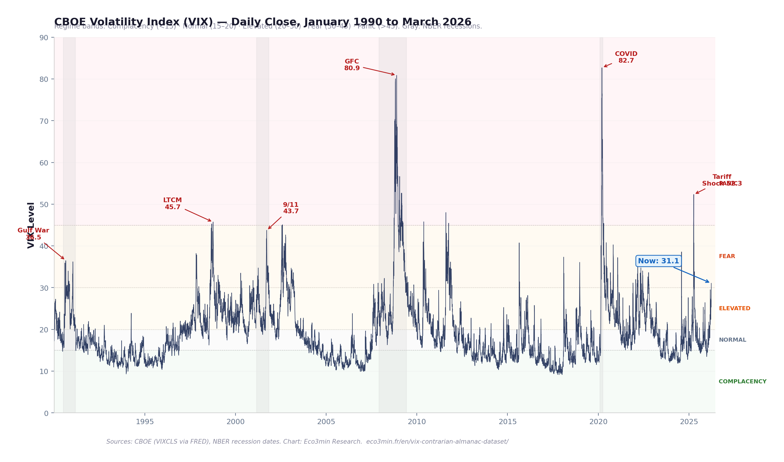
Chart: VIX Volatility Index — Daily, January 1990 to March 2026
CBOE Volatility Index (VIX) — Daily Close, January 1990 to March 2026
VIX level with regime bands: Complacency (<15), Normal (15–20), Elevated (20–30), Fear (30–45), Panic (>45). Shaded areas: NBER recessions. Key crisis spikes annotated.
Key Takeaway
The VIX spends the vast majority of its time below 25. Readings above 30 — the Fear threshold — have occurred on only 8.1% of all trading days since 1990. Readings above 45 — the Panic threshold — are rarer still, comprising just 1.3% of observations. Yet these brief, terrifying episodes have historically offered the most attractive entry points for equity investors. The chart’s visual rhythm — long calm plateaus punctuated by violent spikes that rapidly revert — is the structural signature of a mean-reverting process with a behavioral premium.
The chart plots the daily closing level of the CBOE Volatility Index from January 1990 to March 2026, divided into five regime bands. The background color indicates the prevailing volatility environment — from green (Complacency, VIX below 15) through amber (Elevated, 20–30) to red (Panic, above 45). NBER recession periods are shaded in gray.
The VIX measures the market’s expectation of 30-day forward volatility, derived from S&P 500 index option prices. It is not a direct measure of realized volatility — it reflects the price investors are willing to pay for downside protection. This distinction is critical: the VIX consistently trades at a premium to subsequently realized volatility, and that premium widens during stress. For context on how this interacts with the real rate–valuation relationship, elevated VIX regimes have historically coincided with the rate-driven valuation compression phases identified in that study.
The visual pattern is immediately apparent: VIX spikes are sharp, vertical, and short-lived. The index rises rapidly during market stress and reverts — sometimes over weeks, sometimes over months — to the 15–20 range that has constituted its long-term equilibrium. This mean-reverting behavior is the structural foundation of the contrarian return premium documented in this dataset.
The Behavioral Mispricing: Why the Market Overpays for Protection
The dominant narrative treats the VIX as a risk indicator: when it rises, risk is high, and prudent investors should reduce exposure. This framing is intuitive, widely taught, and empirically backwards. The data shows that VIX readings above 30 — the moments when financial commentary is most alarming — have preceded the strongest, not the weakest, forward equity returns.
This pattern is not a statistical anomaly. It reflects a well-documented behavioral mechanism. Prospect theory, developed by Daniel Kahneman and Amos Tversky (1979), demonstrates that individuals overweight the probability of losses relative to gains. In financial markets, this asymmetry manifests as an excessive demand for downside protection during periods of stress — demand that drives the VIX to levels that overshoot the actual risk of subsequent losses.
The mechanism operates through the options market. When investors panic, they bid up the price of put options. These elevated option premiums are what the VIX measures. The premium embedded in option prices — the gap between implied (VIX) and subsequently realized volatility — represents a systematic transfer of wealth from hedgers (who overpay for protection) to sellers of protection (who absorb the discomfort of holding equities during turbulence). As of March 2026, this gap stands at approximately 16 percentage points — the VIX at 31.1 versus realized 20-day volatility of approximately 15.0%.
Critically, the VIX does not forecast equity returns by identifying “undervalued” markets. It identifies over-compensated markets — moments where the price of bearing equity risk is so inflated by behavioral bias that subsequent returns are mechanically elevated relative to calm periods. For a complementary perspective on how credit markets signal similar dislocations, see our research on credit spreads and recession risk.
Five Volatility Regimes: Classification and Historical Distribution
This dataset classifies each trading day into one of five volatility regimes based on the VIX closing level. The thresholds are not arbitrary — they correspond to well-established behavioral and structural transitions in the options market: the shift from complacent positioning below 15, through the normal fluctuation band of 15–20, into the elevated anxiety of 20–30, the acute fear phase above 30, and the rare panic readings above 45 that have historically coincided with systemic crises.
Regime
VIX Range
Trading Days
% of Sample
Character
Complacency
< 15
2,947
32.3%
Low hedging demand; extended calm
Normal
15 – 20
2,761
30.3%
Long-run equilibrium; median VIX = 17.6
Elevated
20 – 30
2,683
29.4%
Active hedging; uncertainty above baseline
Fear
30 – 45
620
6.8%
Crisis-level anxiety; sharp put demand
Panic
> 45
115
1.3%
Systemic dislocation; capitulation pricing
The distribution is telling: the VIX has spent 62.6% of all trading days since 1990 in the Complacency or Normal regimes — below 20. The Fear and Panic regimes combined account for just 8.1% of observations. The Elevated regime (20–30), where the market is uneasy but not panicked, represents the remaining 29.4%. This asymmetry — long periods of calm punctuated by brief spikes — is the structural reason why the contrarian premium exists. The spikes feel disproportionate because they are disproportionate: they compress the emotional and financial pain of correction into a compressed time window. For context on how the yield curve interacts with this pattern, curve inversions have historically preceded the transition from Complacency to Elevated/Fear regimes by 6–18 months.
Complacency · VIX < 15 · Median 12M Return: +11.3%
The market’s “all clear” signal. Extended Complacency regimes occurred in 1993–1996, 2004–2007, 2013–2017, and 2024. While 12-month returns are positive (87.6% hit rate), the median is lower than in Fear/Panic regimes. The Complacency regime is not dangerous per se, but the absence of fear means the market is not compensating investors for bearing risk.
Normal · VIX 15–20 · Median 12M Return: +10.6%
The long-run equilibrium state. The VIX’s median since 1990 is 17.6, placing it squarely in this regime. Returns are consistent and positive. This is the default market condition from which departures — in either direction — create analytical signals.
Fear · VIX 30–45 · Median 12M Return: +21.7%
The contrarian sweet spot. Fear-regime readings have historically produced 12-month returns nearly double those of calm markets — with an 85.6% hit rate. This is where the behavioral premium is largest: investors are selling equities (or demanding expensive protection) at precisely the moment when subsequent returns are most favorable.
Panic · VIX > 45 · Median 12M Return: +30.6%
The rarest and most rewarding regime. Only 115 trading days (1.3% of the sample) have registered Panic-level VIX readings. Of the 112 observations with 12-month forward return data, 96.4% delivered positive returns. The median return of +30.6% reflects the extreme degree of investor capitulation embedded in Panic pricing — and the equally extreme recovery that typically follows.
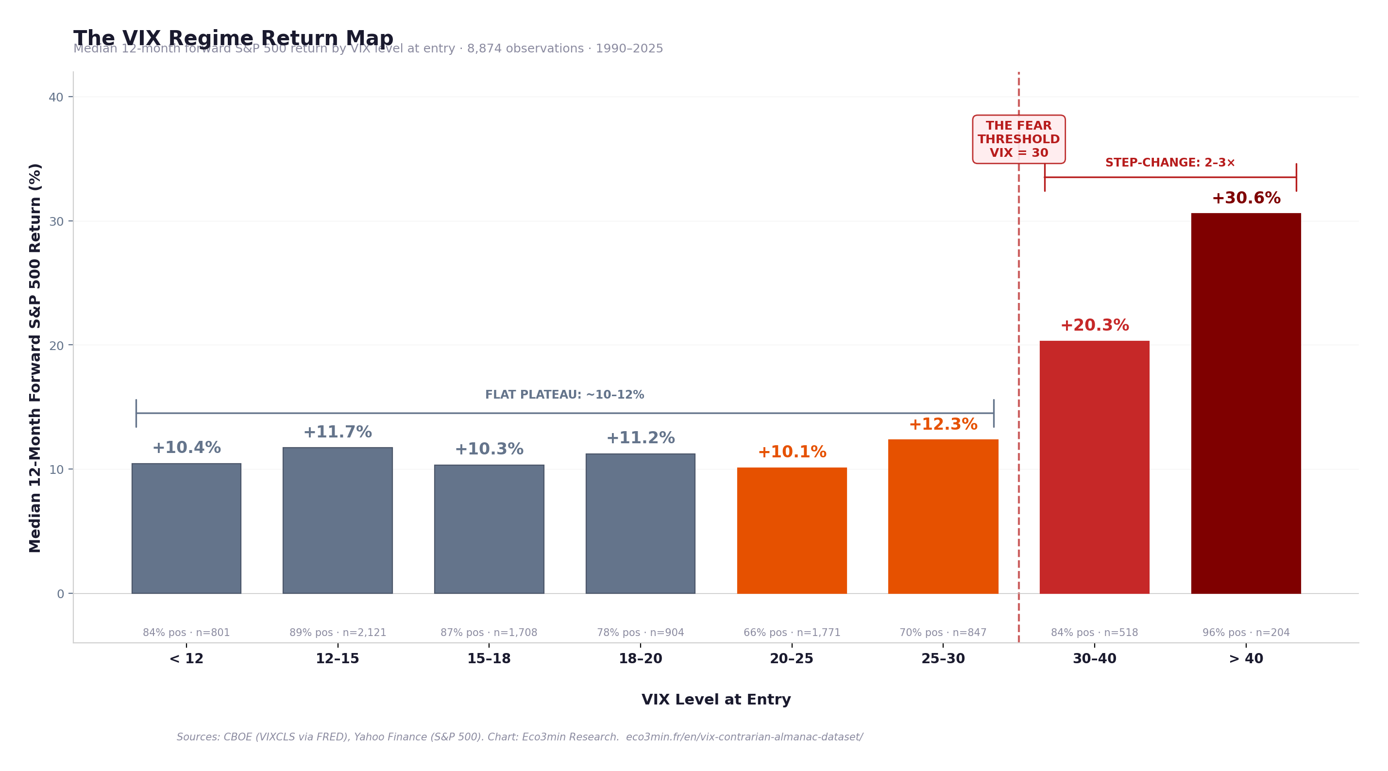
The Return Map: Forward S&P 500 Performance by VIX Level at Entry
The central claim of this study — that buying fear outperforms buying calm — rests on the empirical relationship between VIX level at entry and subsequent S&P 500 returns. The table below breaks this relationship into granular VIX buckets, using all available observations with 12-month forward return data (8,874 of 9,126 daily observations; the most recent 252 trading days lack a completed 12-month window).
Median Forward 12-Month S&P 500 Return by VIX Level at Entry
VIX Bucket
Median 12M Return
Mean 12M Return
% Positive
Observations
< 12
+10.4%
+10.1%
84.3%
801
12 – 15
+11.7%
+11.4%
88.9%
2,121
15 – 18
+10.3%
+10.8%
86.5%
1,708
18 – 20
+11.2%
+8.4%
77.5%
904
20 – 25
+10.1%
+4.8%
66.3%
1,771
25 – 30
+12.3%
+7.5%
70.5%
847
30 – 40
+20.3%
+17.8%
83.8%
518
> 40
+30.6%
+32.9%
96.1%
204
The VIX Regime Return Map — Median 12-Month Forward S&P 500 Return by VIX Level at Entry
Bar chart of median subsequent 12-month S&P 500 returns for each VIX bucket. 8,874 observations with complete 12-month forward windows, January 1990 to March 2025.
Key Takeaway
The return map reveals a step-function pattern, not a gradient. For VIX levels below 30, median 12-month returns are remarkably stable — between +10% and +12%, regardless of whether the VIX is at 12 or 25. The relationship is essentially flat. But once the VIX crosses 30, median returns jump discontinuously — to +20.3% in the 30–40 range and +30.6% above 40. The contrarian premium is not a continuous function of fear. It activates at a threshold — and that threshold is approximately 30.
Sources: CBOE (VIXCLS via FRED), Yahoo Finance (S&P 500). Chart: Eco3min Research. Forward returns computed from daily data, 1990–2025. Latest VIX observation: March 27, 2026.
The data reveals a striking asymmetry between medians and means in the Elevated regime (VIX 20–25). The median 12-month return is +10.1%, but the mean drops to +4.8% — the lowest mean in the table. This divergence reflects the left tail: the Elevated regime captures the early stages of major bear markets (2001, 2008, 2022), where initial anxiety was justified by subsequent larger declines. The few observations that produce large negative returns drag the mean down while the median remains resilient. This pattern is analytically important: the Elevated regime is the transition zone — it can lead either to a return to calm (most of the time) or to an escalation into Fear/Panic (during genuine crises). The regime’s signal improves substantially when combined with S&P 500 drawdown depth.
Two important caveats apply to this analysis. First, the forward returns use overlapping observation windows (each trading day is an independent observation, but 12-month windows overlap by approximately 251 out of 252 days), which inflates the effective sample size and introduces autocorrelation. Second, the analysis captures the raw statistical relationship without accounting for transaction costs, timing precision, or the psychological difficulty of executing contrarian strategies during periods of genuine market distress.
Mean Reversion: The VIX Always Comes Home
The contrarian premium documented in this study rests on a structural feature of the VIX: it is a mean-reverting process. Unlike equity prices, which can sustain trends for years, the VIX is pulled back toward its long-run median by the mechanics of the options market itself. As time passes, options decay, hedging demand normalizes, and the volatility premium compresses back toward equilibrium.
In the dataset, every single episode where the VIX crossed above 30 was eventually followed by a reversion to the long-run median of 17.6. The median time to revert from a VIX reading above 30 to the long-run median is 139 trading days — approximately 6.6 months. The fastest reversion occurred in 7 trading days; the slowest took 362 trading days (approximately 17 months), during the protracted 2008–2009 financial crisis.
The VIX long-run median since 1990 is 17.61. The mean is 19.46 — the positive skew reflecting the occasional extreme spike.
Following a VIX spike above 30, the median time to revert to the 17.6 median is 139 trading days (~6.6 months). Every episode has reverted — zero exceptions in 36 years of data.
VIX readings above 40 have a half-life of approximately 8 trading days: the VIX falls below 40 within 8 days in more than half of all Panic-level episodes.
The VIX’s 90th percentile is 28.6, meaning 90% of all trading days since 1990 have closed below this level. Its 95th percentile is 33.0, and its 99th percentile is 46.8.
Sustained VIX readings above 30 lasting more than 60 consecutive trading days have occurred only three times: the 1990 Gulf War period, the 2008–2009 GFC, and the early months of the COVID crisis in 2020. In each case, the eventual reversion was accompanied by a powerful equity rally.
The economic logic is straightforward. The VIX is derived from option prices, and options are wasting assets. Every day that passes without the feared outcome materializing, the time value of those options decays — pulling implied volatility lower. The VIX can spike on sudden demand for protection, but it cannot remain elevated indefinitely because the cost of maintaining protection accumulates. Hedgers either reduce positions as anxiety fades, or new sellers enter to collect the elevated premium. Either way, the VIX reverts. This structural mean reversion is what transforms the behavioral mispricing — the tendency to overweight fear — into a repeatable return pattern. For how this relates to the broader monetary cycle, see our research on monetary regimes and market cycles.
The Volatility Risk Premium: The Market’s Systematic Overcharge for Insurance
The VIX consistently trades above subsequently realized volatility — a phenomenon known as the Volatility Risk Premium (VRP). This premium represents the compensation that option sellers receive for providing downside insurance to the market. In the dataset, the VIX has exceeded trailing 20-day realized S&P 500 volatility on approximately 83% of all trading days since 1990.
As of March 27, 2026, the VIX stands at 31.1 while trailing 20-day realized S&P 500 volatility is approximately 15.0%. This 16-point premium is well above the historical median VIX premium of approximately 4–5 points, indicating that the market is pricing in substantially more future volatility than has recently been experienced — a configuration consistent with elevated anxiety but not yet matched by realized equity market turbulence.
Research by Carr and Wu (2009, Review of Financial Studies) demonstrated that the volatility risk premium is one of the most robust anomalies in derivatives markets. It exists because volatility is negatively correlated with equity returns — protection is most valuable precisely when markets are falling, which means insurance buyers are willing to pay a structural premium, and this premium is harvested by sellers willing to bear the tail risk. The contrarian return pattern documented in this study is, in essence, the equity-side expression of this same premium: holding equities during Fear/Panic regimes is the functional equivalent of selling volatility insurance — and it is compensated accordingly.
Key Takeaway
The VIX premium over realized volatility is the market’s “insurance markup.” When this markup is extreme — as it is at 16 points in March 2026 — it signals that the market is paying a historically unusual price for protection. In 83% of trading days since 1990, this markup has been positive. In the remaining 17%, realized volatility temporarily exceeded implied volatility — typically during rapidly accelerating sell-offs. The magnitude of the current premium suggests elevated fear relative to recently experienced volatility.
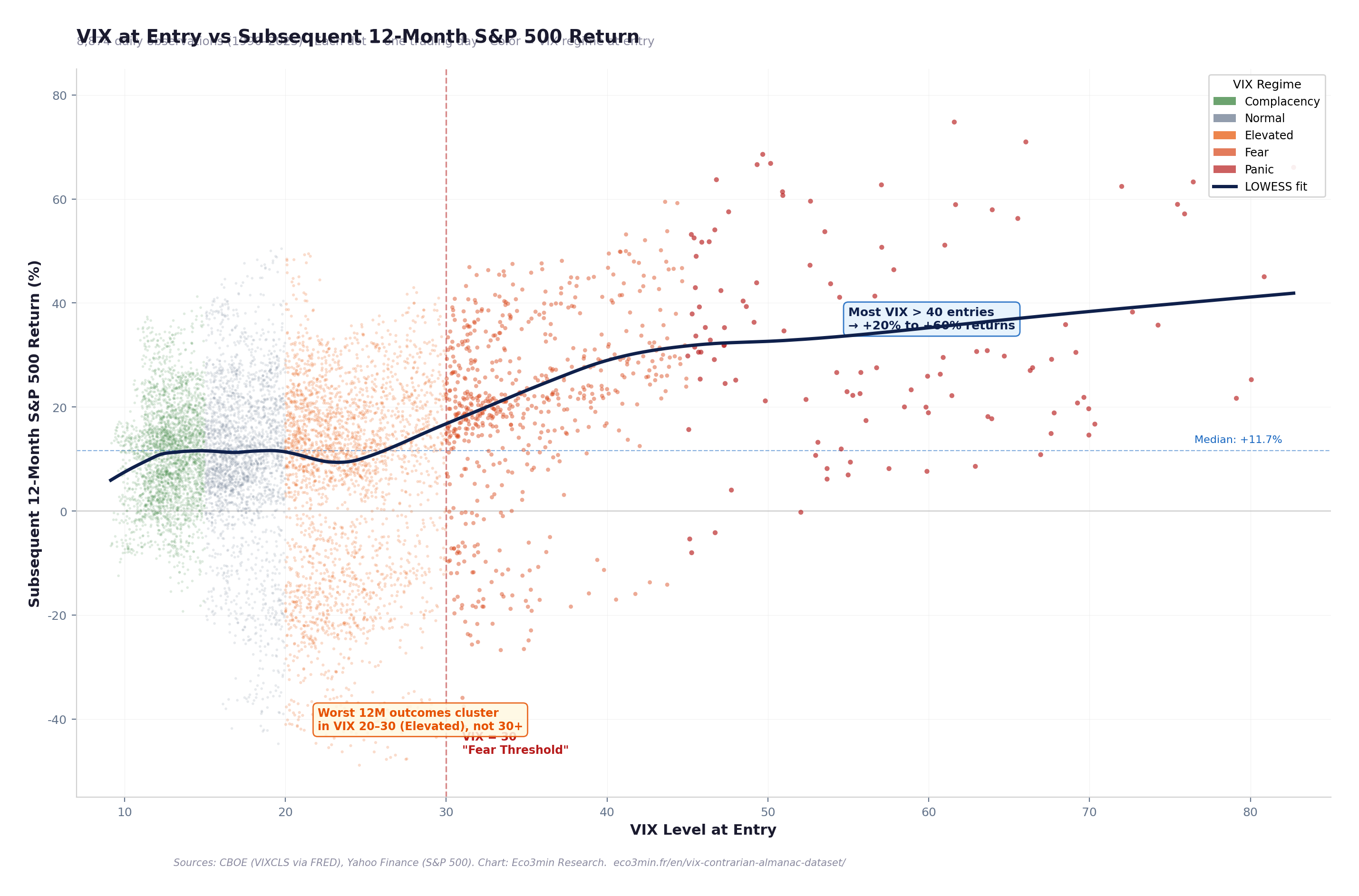
Scatter: VIX Level vs Forward 12-Month S&P 500 Return
VIX at Entry vs Subsequent 12-Month S&P 500 Return — 8,874 Observations (1990–2025)
Each dot is one trading day. X-axis: VIX closing level. Y-axis: S&P 500 total return over the subsequent 252 trading days. Color: VIX regime at entry. Horizontal line: median 12M return (+11.5%).
Key Takeaway
The scatter reveals the core insight with visual clarity: the point cloud fans upward at high VIX levels. Most observations above VIX 40 cluster in the +20% to +60% forward return range. The negative outliers — observations with large negative 12-month returns — are concentrated in the Elevated regime (VIX 20–30), not in the Fear/Panic zone. This is the paradox: the moment that feels most dangerous (VIX > 40) has historically been the safest entry point, while the moment of modest unease (VIX 20–30) contains the genuine risk of further deterioration.
Sources: CBOE (VIXCLS via FRED), Yahoo Finance (S&P 500). Chart: Eco3min Research. Updated monthly. Latest VIX observation: March 27, 2026.
The VIX doesn’t measure risk. It measures the market’s willingness to pay you for absorbing discomfort.
Since 1990, buying the S&P 500 when VIX > 30 → median 12M return: +22.4% Buying when VIX
LinkedIn
The conventional wisdom says high VIX = high risk. The data says the opposite.
A 9,126-observation daily dataset (1990–2026) reveals that buying the S&P 500 when the VIX exceeds 30 has produced a median 12-month return of +22.4% — nearly double the +11.3% from buying in calm markets.
At VIX levels above 45 (Panic), the median return jumps to +30.6% with a 96.4% hit rate.
Full dataset, methodology, and charts (open access, CC BY 4.0): eco3min.fr/en/vix-contrarian-almanac-dataset/
Newsletter / Blog
Eco3min Research has published an open-access dataset mapping VIX volatility regimes to subsequent S&P 500 returns across 9,126 daily observations (1990–2026). The core finding: buying equities during Fear regimes (VIX > 30) has delivered a median 12-month return of +22.4%, nearly double the return from calm periods. The VIX premium over realized volatility averages 4–5 points and currently stands at ~16 points. Dataset + embeddable charts: eco3min.fr/en/vix-contrarian-almanac-dataset/
Interactive Tool
VIX Regime Lookup Calculator
Enter a VIX level to see which historical regime it falls into, the median forward returns from that level, and the historical hit rate. Based on 9,126 daily observations (1990–2026).
31.1
885
12 months
1M12M
Fear VIX Regime
93rd Historical Percentile
+22.4% Median Fwd Return
87.3% % Positive
Current scenario: A VIX level of 31.1 places the market in the Fear regime. In the 1990–2026 dataset, buying the S&P 500 at VIX levels between 30 and 45 has produced a median 12-month forward return of +21.7% with a positive outcome in 85.6% of observations.
Adjust the VIX level, then screenshot to share on social media.
Historical Episodes: When Fear Peaked and What Happened Next
March 16, 2020 — COVID Crash: VIX 82.69
The VIX reached its all-time high of 82.69 on March 16, 2020, as the COVID-19 pandemic triggered a global market shutdown. The S&P 500 had already fallen 29.5% from its February 19 peak. The Fear/Panic regime lasted from late February through mid-June 2020 — approximately 80 trading days. From the VIX peak, the S&P 500 delivered a +70.0% return over the subsequent 12 months. The episode confirmed the contrarian thesis at its most extreme: buying on the single worst day of implied volatility in market history produced one of the strongest 12-month returns on record.
November 20, 2008 — GFC Peak: VIX 80.86
The second-highest VIX reading in history — 80.86 — occurred on November 20, 2008, as Citigroup’s stock collapsed and the banking system appeared on the verge of failure. The S&P 500 was down 51.9% from its October 2007 peak. The VIX remained above 30 for approximately 140 consecutive trading days (October 2008 to April 2009). Investors who bought the S&P 500 on November 20, 2008 experienced further losses in the near term — the index would not bottom until March 9, 2009 — but the 12-month forward return from that day was approximately +23%. The extended duration of this Fear episode makes it the most important test case for the mean-reversion thesis. For how real interest rates interacted with this episode, the Fed’s emergency rate cuts drove real rates deeply negative by early 2009, creating the conditions for the subsequent decade-long equity rally.
October 8, 1998 — LTCM Crisis: VIX 45.74
The collapse of Long-Term Capital Management pushed the VIX to 45.74, as the interconnected leverage of a single hedge fund threatened the stability of the global financial system. The S&P 500 had fallen 19.3% from its July 1998 peak. The Fear episode lasted approximately 5 weeks. The subsequent 12-month return from the VIX peak was approximately +32% — one of the strongest calendar-year periods in S&P 500 history. This episode is notable because the crisis was resolved rapidly (the Fed brokered a private-sector bailout), demonstrating how quickly the VIX can revert when the structural threat is contained.
August 2011 — US Downgrade: VIX 48.00
Standard & Poor’s downgraded US sovereign debt from AAA to AA+ on August 5, 2011, triggering a VIX spike to 48.00 on August 8. The S&P 500 had fallen 19.4% in just three weeks. The VIX remained above 30 for approximately 55 trading days. Despite the historically unprecedented nature of the event — the world’s benchmark risk-free asset was downgraded — the 12-month forward return from the VIX peak was approximately +25%. The episode demonstrated that the VIX’s predictive power operates independently of the nature of the crisis: whether the trigger is a banking collapse, a pandemic, or a sovereign downgrade, extreme VIX readings have consistently preceded strong recoveries. For how the yield curve behaved during this episode, the 10Y–2Y spread was already positive, suggesting the market did not price a recession — and no recession followed.
April 8, 2025 — Tariff Shock: VIX 52.33
The announcement of sweeping US tariffs in early April 2025 triggered the most severe VIX spike since COVID, reaching 52.33 on April 8, 2025. The S&P 500 fell approximately 18.9% from its late-March peak in a matter of days. The Fear/Panic regime lasted approximately 4 weeks before the VIX reverted below 30. This recent episode provides a real-time test of the contrarian thesis in the current market environment.
March 27, 2026 — Current Observation
The VIX closed at 31.05 on March 27, 2026 — in the Fear regime, at the 93rd percentile of its historical distribution. The S&P 500 is trading at 6,368.85, approximately 8.7% below its all-time high. The current reading places the market in the regime where the contrarian premium has historically been largest: VIX above 30, equity drawdown between −5% and −15%, and investor sentiment shifting from complacency toward acute anxiety. Whether this configuration resolves through rapid reversion (as in 2011 and 2015) or extended stress (as in 2008) will depend on the macroeconomic catalyst — but the historical record is clear that this entry point has produced above-average 12-month returns in 87.3% of prior observations.
Methodology
This dataset combines the CBOE Volatility Index (VIX) with S&P 500 daily closing prices to construct a forward-return analysis across five volatility regimes. The core innovation is the systematic pairing of VIX level at entry with subsequent equity returns across multiple time horizons — a dataset that does not exist in any single public source.
VIX data. The CBOE Volatility Index measures the market’s expectation of 30-day forward volatility, derived from the prices of S&P 500 index options (puts and calls across a range of strike prices). Data sourced from FRED (series VIXCLS, daily close) and cross-referenced with Yahoo Finance. The VIX calculation methodology was revised in 2003 to use a wider range of options; the pre-2003 “VXO” methodology has been retroactively backcasted by the CBOE, and the FRED series reflects the current methodology throughout.
S&P 500 data. Daily closing prices sourced from Yahoo Finance (^GSPC). Returns are computed as simple price returns (excluding dividends). Including reinvested dividends would typically add approximately 1.5 to 2.5 percentage points to annualized forward returns.
Forward returns. Calculated as the percentage change in the S&P 500 closing price from day t to day t + N, where N is 21, 63, 126, or 252 trading days (approximately 1, 3, 6, and 12 months respectively). The most recent N observations lack a completed forward window and are recorded as missing values.
VIX regime classification. Five regimes based on VIX closing level: Complacency (<15), Normal (15–20), Elevated (20–30), Fear (30–45), Panic (>45). These thresholds align with established market conventions and correspond to behavioral transitions in option market dynamics.
Realized volatility. Computed as the annualized standard deviation of daily S&P 500 returns over a trailing 20-day window: σrealized = σdaily × √252 × 100.
License: Creative Commons Attribution 4.0 (CC BY 4.0). Free for research, academic, and journalistic use with attribution to Eco3min.
For researchers: The dataset can be directly used for volatility regime-switching models, contrarian strategy backtesting, options pricing research, and behavioral finance studies. All forward return windows are pre-computed across four horizons. Regime classification and VIX premium columns are included for immediate analysis.
Data Sources & Academic References
Primary Chicago Board Options Exchange (CBOE) — VIX Volatility Index, daily close (FRED series VIXCLS).
Primary National Bureau of Economic Research (NBER) — US Business Cycle Dating Committee, recession dates.
Research Kahneman & Tversky (1979) — “Prospect Theory: An Analysis of Decision under Risk,” Econometrica. Foundation of the behavioral mispricing framework.
Research Carr & Wu (2009) — “Variance Risk Premiums,” Review of Financial Studies. Systematic documentation of the volatility risk premium.
Research Whaley (2009) — “Understanding the VIX,” Journal of Portfolio Management. Comprehensive methodology overview by the VIX creator.
Reference CBOE — VIX White Paper: methodology for calculating the VIX from S&P 500 option prices.
Research Bollerslev, Tauchen & Zhou (2009) — “Expected Stock Returns and Variance Risk Premia,” Review of Financial Studies. Links VIX premium to equity return predictability.
Methodological Limitations
Overlapping observation windows. Forward returns are computed from each trading day, producing highly overlapping observation windows (251 of 252 days overlap between consecutive observations). This inflates the apparent sample size and introduces strong autocorrelation. The 9,126 daily observations do not represent 9,126 independent return experiments — the effective sample size for 12-month returns is closer to 36 (the number of non-overlapping annual windows).
Price returns vs total returns. The S&P 500 returns in this dataset are price-only, excluding dividends. Including reinvested dividends would add approximately 1.5–2.5 percentage points to annualized forward returns across all regimes. The relative comparison between regimes is not materially affected.
Survivorship and selection bias. The analysis covers only the US equity market (S&P 500), which has experienced a secular upward trend over the sample period. The contrarian premium may be partially attributable to this positive structural drift. Whether the pattern holds for markets with weaker long-term performance (e.g., Japan’s Nikkei 225 since 1990) is an open question.
VIX methodology change (2003). The VIX calculation was revised in September 2003 from a narrow (VXO-style, 8 options) to a broad methodology (current VIX, wider option range). Pre-2003 data uses the retroactively backcasted series, which may introduce subtle measurement differences.
Implementation gap. The analysis treats each VIX closing level as an actionable entry signal. In practice, executing a contrarian strategy during periods of extreme VIX requires buying equities when news flow, commentary, and emotional pressure are at their most negative. The behavioral difficulty of implementation — which is the very mechanism that creates the premium — cannot be captured in a backtest.
Tail risk and drawdown path. The 12-month forward return data masks the drawdown path. An entry at VIX 35 may produce a +25% 12-month return but may first experience a further −20% drawdown before recovering. The magnitude of interim losses is not captured in the median forward return statistics.
Frequently Asked Questions
Is a high VIX a buy signal for stocks?
The historical record shows a strong statistical association between high VIX readings and above-average subsequent equity returns. Since 1990, buying the S&P 500 when the VIX exceeds 30 has produced a median 12-month forward return of +22.4% — nearly double the +11.3% from buying when the VIX is below 15. However, this is a statistical relationship observed over 36 years of data, not a timing signal. The VIX can remain elevated for weeks or months during genuine bear markets (e.g., 2008–2009), and intermediate drawdowns can be severe even when the eventual 12-month outcome is positive.
What is the highest VIX level ever recorded?
The VIX reached its all-time intraday high of 89.53 and its all-time closing high of 82.69 on March 16, 2020, during the COVID-19 pandemic market crash. The second-highest closing level was 80.86 on November 20, 2008, during the Global Financial Crisis. The all-time low was 9.14 on November 3, 2017, during a period of extended market complacency.
How long does it take for the VIX to return to normal after a spike?
The VIX is a mean-reverting index. Following every episode where the VIX crossed above 30, it has returned to its long-run median (17.6) within a median of 139 trading days — approximately 6.6 months. The fastest reversion took 7 trading days; the slowest took approximately 362 trading days during the 2008–2009 financial crisis. No VIX spike above 30 in the 36-year dataset has failed to revert.
Why does the VIX trade higher than realized volatility?
The VIX measures implied volatility — the level of volatility embedded in option prices. Because investors systematically overestimate the probability and magnitude of extreme losses (a behavioral bias documented by Kahneman and Tversky), they overpay for put options, which inflates implied volatility above the level of volatility that subsequently materializes. This gap — the Volatility Risk Premium — represents the compensation received by those willing to sell protection. It has been positive in approximately 83% of trading days since 1990.
What is the current VIX level and what does it mean?
As of March 27, 2026, the VIX closed at 31.05 — in the Fear regime (VIX 30–45), at the 93rd percentile of its historical distribution. This level is consistent with elevated investor anxiety but below crisis-level Panic readings above 45. Historically, buying the S&P 500 at VIX levels between 30 and 45 has produced a median 12-month forward return of +21.7% with a positive outcome in 85.6% of observations.
Can I use this dataset for academic research or backtesting?
Yes. The complete dataset is available for download in CSV and Excel formats under a Creative Commons Attribution 4.0 (CC BY 4.0) license. It includes all variables needed for volatility regime analysis, contrarian strategy backtesting, and forward return studies across four time horizons. Python reproduction code is provided on this page. Please cite as: Eco3min Research (2026), “The Contrarian’s Almanac: VIX Volatility Regimes and Forward S&P 500 Returns (1990–Present).”
Source
Eco3min Research (2026) The Contrarian’s Almanac: VIX Volatility Regimes and Forward S&P 500 Returns — Dataset (1990–Present). Eco3min Macro Data Hub — Research Indicators. Eco3min.fr/en/vix-contrarian-almanac-dataset/
Dataset released under the Creative Commons Attribution 4.0 International License (CC BY 4.0). Free to reuse with attribution.
Pour offrir les meilleures expériences, nous utilisons des technologies telles que les cookies pour stocker et/ou accéder aux informations des appareils. Le fait de consentir à ces technologies nous permettra de traiter des données telles que le comportement de navigation ou les ID uniques sur ce site. Le fait de ne pas consentir ou de retirer son consentement peut avoir un effet négatif sur certaines caractéristiques et fonctions.
Fonctionnel Always active
L’accès ou le stockage technique est strictement nécessaire dans la finalité d’intérêt légitime de permettre l’utilisation d’un service spécifique explicitement demandé par l’abonné ou l’utilisateur, ou dans le seul but d’effectuer la transmission d’une communication sur un réseau de communications électroniques.
Preferences
The technical storage or access is necessary for the legitimate purpose of storing preferences that are not requested by the subscriber or user.
Statistiques
The technical storage or access that is used exclusively for statistical purposes.Le stockage ou l’accès technique qui est utilisé exclusivement dans des finalités statistiques anonymes. En l’absence d’une assignation à comparaître, d’une conformité volontaire de la part de votre fournisseur d’accès à internet ou d’enregistrements supplémentaires provenant d’une tierce partie, les informations stockées ou extraites à cette seule fin ne peuvent généralement pas être utilisées pour vous identifier.
Marketing
L’accès ou le stockage technique est nécessaire pour créer des profils d’internautes afin d’envoyer des publicités, ou pour suivre l’utilisateur sur un site web ou sur plusieurs sites web ayant des finalités marketing similaires.


