The 2000 Dot-Com Crash: a regime shift read through the indicators
How, between 2000 and 2002, the United States shifted into a disinflationary slowdown — an equity crash of nearly 78% that did not become a credit crisis: read through the Eco3min indicators.
The dot-com crash did not arrive without warning: equity valuations reached a historic high in late 1999 and the yield curve inverted in the summer of 2000. The NASDAQ then lost nearly 78% of its value, and the U.S. regime shifted from the ordinary cycle into a disinflationary slowdown. Yet, unlike 2008, financial conditions never left their normal range: the decline stayed lodged in equities, without turning into a credit crisis.
Over 2000-2002, the United States was in a Slowdown (G− I=), disinflationary meta-regime, with no layer-2 overlay whatsoever. Triggered by the bursting of the technology bubble (peak on 10 March 2000), the episode saw the NASDAQ lose nearly 78% without becoming a credit crisis: financial conditions never tipped into stress.
Timeline of the shift
Five milestones capture the passage from an unprecedented equity euphoria to a brief recession that stayed clear of the credit system.
- December 1999 — Robert Shiller’s cyclically adjusted price-to-earnings ratio (CAPE) reaches a historic high near 44, a sign of equity valuations without equal in the post-war period.
- 10 March 2000 — The NASDAQ Composite peaks at 5,048.62 points (FRED, series NASDAQCOM); the technology sell-off begins in the following weeks.
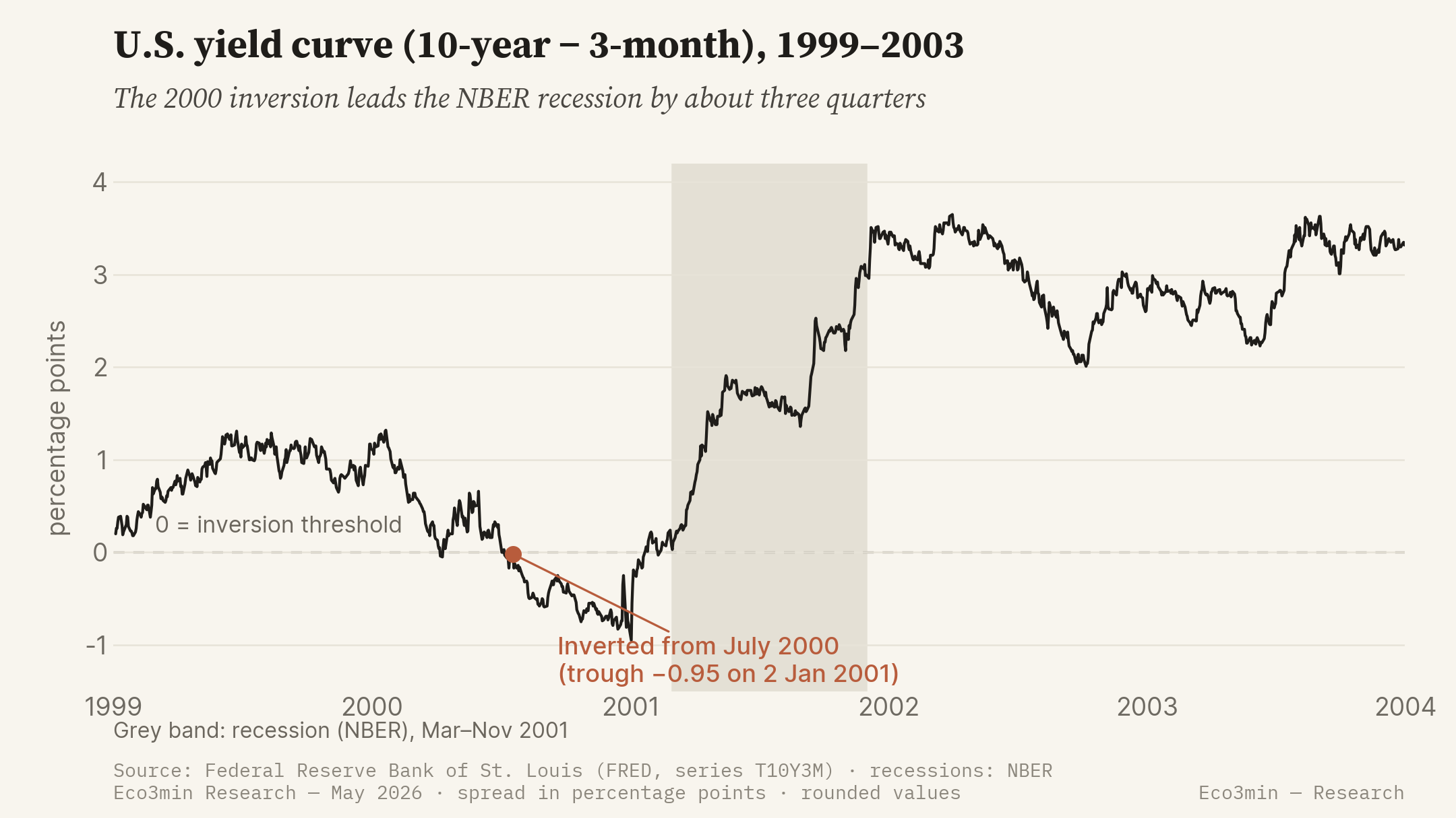
- July 2000 — The yield curve (10-year minus 3-month) inverts durably (FRED, series T10Y3M), a leading recession signal.
- March-November 2001 — Recession dated by the National Bureau of Economic Research (NBER), eight months; the Fed lowers its policy rate from 6.50% to 1.75% over the year, across eleven cuts.
- 2 December 2001 and 21 July 2002 — Bankruptcies of Enron, then WorldCom; the accounting mistrust prolongs the decline, and the NASDAQ reaches its trough at 1,114.11 on 9 October 2002, −77.9% from the peak.
The indicators before the crisis
The value of reading this episode through the indicators lies in an asymmetry: several signals were legible before the March 2000 peak, but another one, which might have been expected, never came. Here is what the series were saying.
The CAPE reaches a historic high near 44 in December 1999, well above its long-run average. An extreme valuation does not date the turn, but it gauges the potential scale of the correction.
Shiller CAPEDurably inverted from July 2000 (FRED, series T10Y3M), with a trough of −0.95 point on 2 January 2001. The New York Fed treats it as one of its leading recession indicators.
series T10Y3MStayed close to their average, and most often below it — hence looser than normal — throughout the sequence (FRED, series NFCI). The financial-stress signal never came.
NFCI indexAround 290,000 per week in mid-2000 (FRED, series ICSA), they rose above 400,000 during 2001, confirming with a lag the deterioration of the labour market.
series ICSAThis time, the dominant signal is not macroeconomic but equity-based. Robert Shiller’s cyclically adjusted price-to-earnings ratio (CAPE) reaches a historic high near 44 in December 1999. Such a valuation does not date the turn — an expensive market can stay expensive for a long time — but it gauges the scale of the possible correction. As early as the spring of 2000, Robert Shiller makes it the central argument of his book Irrational Exuberance.
The yield curve provides the macroeconomic signal. The spread between the 10-year yield and the 3-month Treasury bill (FRED, series T10Y3M) inverts durably from July 2000 and reaches a trough of −0.95 point on 2 January 2001. The work of Arturo Estrella and Frederic Mishkin for the New York Fed establishes that this spread precedes U.S. recessions by several quarters; here, the inversion leads the activity peak dated to March 2001 by the NBER by about three quarters. Economically, an inverted curve reflects the market pricing future rate cuts, hence a slowdown: a signal of expectation, not a direct cause of the recession.
One indicator, by contrast, gives no warning. Financial conditions as measured by the Chicago Fed’s NFCI stay close to their average — and most often below it — throughout the sequence. This absence of a signal is not a blind spot in the analysis: it foretells the nature of the episode. The shock will lodge in equity valuations, not in the credit market.
The regime shift
The transmission follows a shorter chain than in 2008. The price correction erases the wealth effect and, above all, dries up the equity-market financing of technology firms; business investment — especially spending on computing and telecommunications equipment, oversized during the euphoria — contracts. The CFNAI-MA3 activity gauge turns negative as early as the summer of 2000 and reaches −0.74 in the spring of 2001. But the chain stops there: the banking system, little exposed to equity leverage, does not suffer balance-sheet losses comparable to those on mortgage assets in 2008.
Over this period, the Eco3min classifier returns the Slowdown state (G− I=): growth contracts, but core inflation does not collapse — the Dallas Fed’s Trimmed Mean PCE stays positive and never moves into I−. The destination is therefore a slowdown within the disinflationary meta-regime, and not a Disinflationary Contraction (G− I−). This reading is literal: it follows from the engine’s U.S. inputs (growth, inflation, financial conditions). One reservation applies, however: 2000-2002 precedes the engine’s documented backtest window (2003+); the cyclical state is computed here from contemporaneous series, out-of-sample, and is not a monthly verdict as it is for 2008.
What sets 2000 apart from 2008 turns on layer 2. In 2008, an acute financial-stress overlay and the activation of the Dollar Shortage accompanied the cyclical deterioration. Here, no overlay triggers. The NFCI never crosses the +0.30 threshold that conditions the Dollar Shortage — its high over the period is +0.03, on 9 June 2000 — and it stays far below the stress levels of 2008. This is a measured result, not a judgment: the layer-2 triggers are not reached. The equity crash does not become a credit crisis.
What makes 2000-2002 a regime shift therefore rests on the cyclical layer alone: growth moves into G− and the economy leaves the ordinary cycle for a disinflationary slowdown. Unlike 2008, the growth × inflation grid suffices to characterise the episode, precisely because there is no financial overlay to superimpose on it. The single-layer reading is not a simplification here: it is the real state of the episode.
The cyclical destination of this crisis is thus the disinflationary meta-regime of the Eco3min Atlas (the disinflationary regime), with no layer-2 overlay. This page describes the sequence of the shift; the Atlas page describes the destination state.
The central-bank response
The response is first monetary, and conventional. The Federal Reserve, which had raised its policy rate to 6.50% by the end of 2000, lowers it to 1.75% over the course of 2001 (federal funds target; FRED, series DFF for the effective rate), across eleven cuts, the first as early as 3 January 2001, outside a scheduled meeting. The rate is then brought down to 1.00% in June 2003.
What is not deployed is as telling as what is. In 2001-2002 there are no asset purchases (quantitative easing will appear only in 2008), no emergency liquidity facilities, and no foreign-exchange swap lines. The Fed’s balance sheet records no exceptional expansion. The reason is simple: market financing does not seize up, and the policy rate does not reach its floor. The central bank therefore keeps the conventional room for manoeuvre that the 2008 crisis would take away.
Two one-off elements complete the picture. The attacks of 11 September 2001 trigger a closure of the equity markets and lead the Fed to provide liquidity and to cut its rate further. On the fiscal side, tax cuts are adopted in 2001 and again in 2003. The whole remains incomparable, in scale and in the instruments used, with the emergency apparatus of 2008.
The prolonged maintenance of low rates, down to 1.00% in 2003, would later feed a debate over its role in shaping the housing cycle of the 2000s. That debate lies beyond the scope of this page, which documents the 2000-2002 shift; it belongs to the following sequence (see the 2008 crisis).
Assets and markets
Asset trajectories polarise around valuation. The NASDAQ Composite, the showcase of technology stocks, loses 77.9% between its 10 March 2000 peak (5,048.62 points) and its 9 October 2002 trough (1,114.11). The broad S&P 500 index falls by nearly half over the same window. U.S. government bonds appreciate as the Fed lowers rates. The trade-weighted dollar (DTWEXBGS) sees nothing like the rush observed in 2008: with no shortage of U.S.-dollar funding, the Dollar Shortage channel stays inactive.
The trajectories and levels described here are retrospective, for the purpose of historical analysis. They constitute neither a projection nor an investment recommendation, and past performance is no guarantee of future performance.
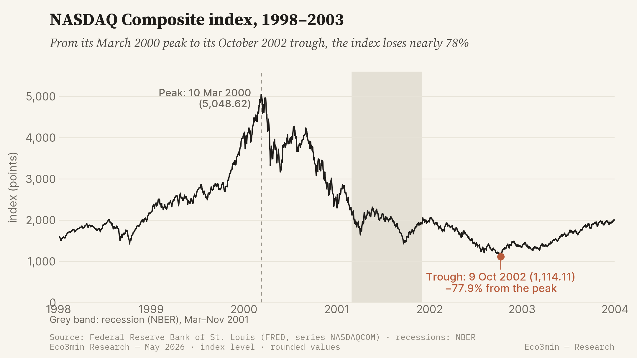
The scale of the decline does not sit easily with the idea of a mere correction. At its trough, the NASDAQ had erased nearly four-fifths of its value, and would not regain its March 2000 level for some fifteen years. The concentration of losses in technology and telecommunications stocks — the most exposed to the late-1990s investment excess — explains the gap with the S&P 500, which was half as affected.
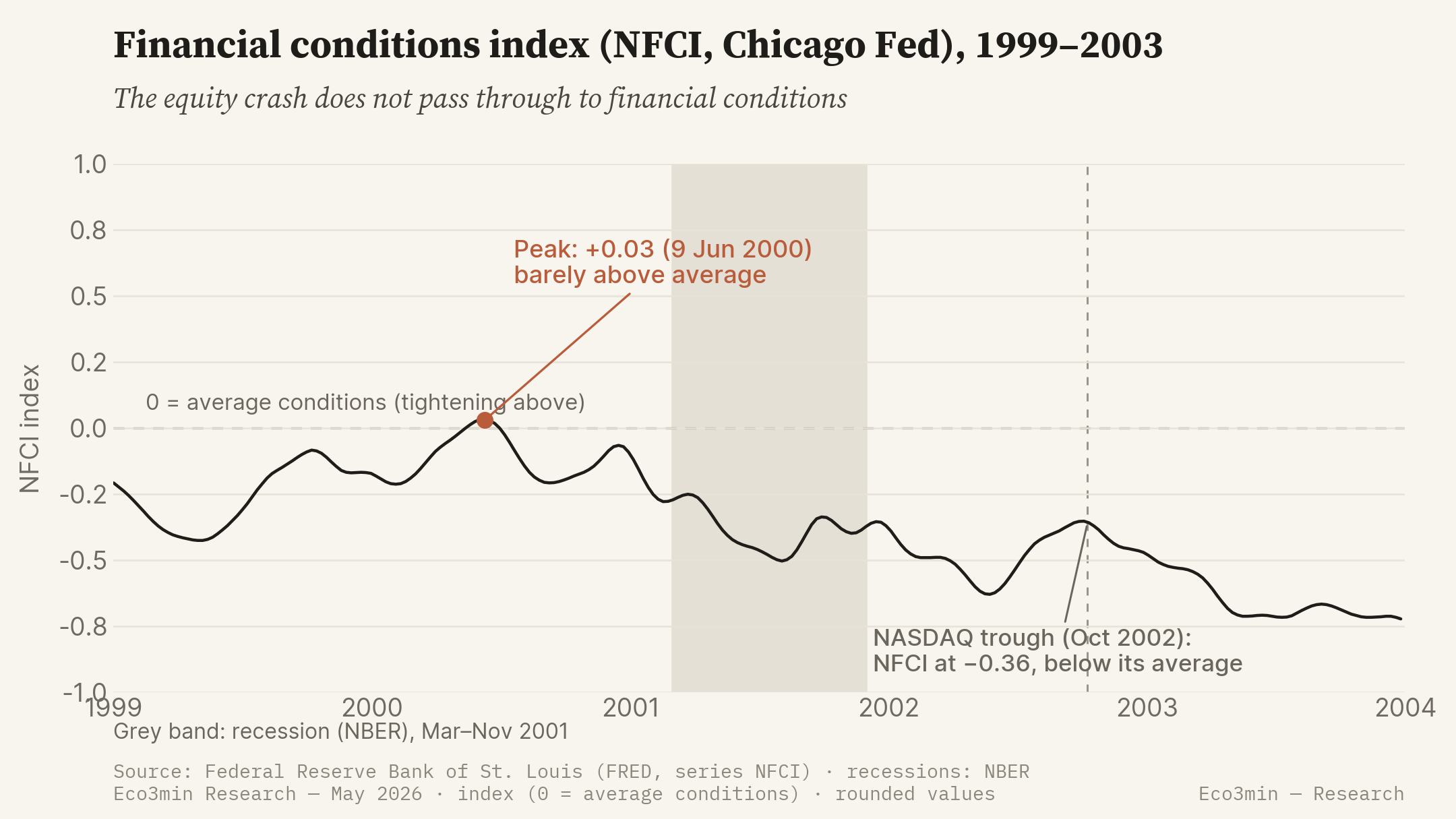
The contrast with the credit market is the central observation of this episode. While the NASDAQ loses three-quarters of its value, the NFCI never leaves the range of normal conditions: its high, +0.03, is reached in June 2000, and the index stays most often negative — hence looser than average — until the equity trough of October 2002, where it stands at −0.36. For reference, the same index peaked at 3.07 in the autumn of 2008. The deflation of equity prices does not pass through to the cost or the availability of credit.
On the real-economy side, the recession dated by the NBER runs from March to November 2001, eight months — one of the briefest in the post-war period. The labour market deteriorates with a lag, however: the unemployment rate, at 4.3% at the start of the recession, keeps rising to 6.3% in June 2003 (Bureau of Labor Statistics), well after the official end of the contraction. This “jobless recovery” prolongs the felt experience of the crisis beyond its dating.
What was different this time
The comparable of the same disinflationary meta-regime, and an earlier one, is the crash of 1929. As in 1929, the episode starts from an equity bubble of historic scale: the Dow Jones had lost nearly 90% between 1929 and 1932; the NASDAQ loses nearly 80% between 2000 and 2002. In both cases, a decade of innovation and financial euphoria precedes a collapse in prices. It is this surface resemblance that fed, in 2000-2001, the fear of a new 1929.
Three structural factors nevertheless distinguish 2000-2002 from 1929.
- A shock confined to equity valuation. In 1929, the equity decline interlocked with a banking panic and a general deflation of prices. In 2000-2002, the fall stays lodged in equity prices and in the investment of technology firms; financial conditions and credit do not contract, as an NFCI that stayed close to zero throughout shows.
- The absence of a banking panic. Federal deposit insurance (FDIC) and an active central bank prevent the runs and the monetary contraction that, between 1930 and 1933, had cut the money supply by about a third. In 2001-2002, the money supply instead keeps growing.
- A fast and aggressive monetary easing. The Fed lowers its rate from 6.50% to 1.75% in 2001, then to 1.00% in 2003. In the 1930s, under the gold-standard constraint, monetary policy had stayed passive, even restrictive.
What invalidated the analogy is measurable. Despite an equity collapse of a magnitude comparable to 1929, the 2001 recession was one of the mildest in the post-war period: eight months, a moderate decline in activity, unemployment peaking at 6.3%. A crash on the order of 1929 thus produced a recession bearing no comparison with the Great Depression — not by luck, but because the institutional architecture (an active central bank, deposit insurance, the absence of monetary contraction) severed the transmission from asset prices to the real economy that had made 1929.
One qualification is needed, the exact mirror of 2008. For the 2008 crisis, the cyclical grid under-described the episode until the financial-stress overlay was added to it; here it is the reverse. The growth × inflation grid — Slowdown, disinflationary meta — suffices to account for 2000-2002, precisely because no layer-2 overlay activates. The absence of an overlay is not a flaw in the reading: it is the result, and it is what separates an equity crash from a systemic crisis. Two crises can thus reach the same cyclical destination — the disinflationary slowdown — by opposite routes: one, in 2000, through the valuation channel alone; the other, in 2008, by adding a measured financial shock to it.
The NASDAQ loses nearly 80% of its value between 2000 and 2002, without financial conditions ever leaving their usual range: an equity crash that did not become a credit crisis.
Where this crisis leads
The 2000-2002 crisis leads to the disinflationary meta-regime, with no layer-2 overlay — which is what sets it apart from 2008, which reaches the same destination by another route. The Atlas page describes the destination state; this page documents its entry sequence.
The meta-regime where the majority of post-war U.S. crises land: constrained growth, inflation tilting lower. In 2000-2002 it is reached with no financial overlay added on top.
Atlas — disinflationary regimeThe 2008 crisis reaches the same cyclical state (Slowdown, disinflationary meta), but by activating a layer-2 overlay — acute financial stress, Dollar Shortage — that the dot-com crash never triggered.
2008 financial crisisSources
- Shiller, R. (2000), Irrational Exuberance, Princeton University Press — equity valuation and the CAPE ratio.
- Estrella, A. & Mishkin, F. (1996, 1998), Federal Reserve Bank of New York — the predictive power of the yield curve for recessions.
- National Bureau of Economic Research (NBER) — business-cycle dating (recession from March to November 2001).
- Federal Reserve — FOMC statements (2001-2003), federal funds rate cuts.
- U.S. Bureau of Labor Statistics — unemployment rate.
- Eco3min data: NASDAQ Composite (NASDAQCOM), yield curve (T10Y3M), financial conditions (NFCI), policy rate (DFF), activity gauge (CFNAI-MA3), initial weekly jobless claims (ICSA), unemployment rate (UNRATE), Shiller CAPE.
Last updated — 31 May 2026
Disclaimer – Financial Information: The analyses, commentary, and content published on eco3min.fr are provided for informational and educational purposes only. They do not constitute investment advice or a solicitation to buy or sell financial instruments. Past performance is not indicative of future results. All investment decisions involve risk and are the sole responsibility of the reader.