
U.S. Electricity Prices Adjusted for Inflation, State by State, 2019-2026
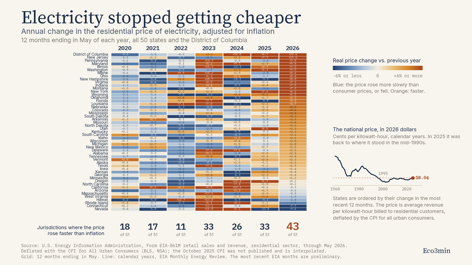
In the twelve months to May 2026, the residential price of electricity rose faster than inflation in 43 of the 50 states and the District of Columbia. Four years earlier, in the year to May 2022, it did so in 11 of them. That reversal, and not the level of the price itself, is what separates the current period from the two decades that preceded it.
The national numbers are undramatic. Measured in constant dollars, American households paid 17.8 cents per kilowatt-hour over the twelve months to May 2026, against 16.7 cents over the equivalent period ending in May 2019, a real increase of 6.8 percent across seven years. What has changed is not the size of the increase but its breadth: the periods when most states saw electricity get cheaper relative to everything else have given way to a period when most states see the opposite. This page documents that shift across all 51 jurisdictions, with the full dataset available for download.
Key findings
Coverage: 50 states and the District of Columbia, no exclusions
Metric: average revenue per kilowatt-hour billed to residential customers, deflated by the CPI for all urban consumers
Periods: twelve months ending in May, from 2019 to 2026
Jurisdictions where the real price rose, year to May 2026: 43 of 51
Year to May 2022, for comparison: 11 of 51
National real price: 16.7 to 17.8 cents per kilowatt-hour, 2019 to 2026, in 2026 dollars
Largest real increase over seven years: District of Columbia, 41.4 percent
Largest real decrease over seven years: Nevada, 12.9 percent
Spread between the two: 54 percentage points
National price in calendar 2025: 18.0 cents in 2026 dollars, the highest since 1995 and well below the 24 to 29 cents recorded in the 1960s and early 1980s
What the national average says, and what it hides
The long series is the necessary starting point, because it settles a question that headline commentary usually skips. In constant dollars, electricity in the United States became steadily cheaper for four decades. The residential price stood at 29.5 cents per kilowatt-hour in 1960 and 24.2 cents in 1983, both expressed in 2026 dollars, and fell to 16.0 cents by 2000. Households today pay materially less in real terms than their grandparents did, and any account of the present that begins with the phrase “electricity has never been this expensive” is describing nominal dollars, not purchasing power.
What ended around the turn of the century was the decline itself. From 2000 onward the real price stopped falling and began to drift upward, reaching 18.0 cents in calendar 2025, its highest reading since 1995. Thirty years of the previous trend have been undone, and the level is now back where it stood in the middle of the Clinton administration. That is a meaningful statement about the direction of the series. It is not a statement about a record, and the difference matters for anyone tempted to read the current period as unprecedented.
The national figure also conceals almost everything interesting. Between 2019 and 2026 the real residential price rose 41.4 percent in the District of Columbia, 33.7 percent in California and 29.4 percent in Maine, while falling 12.9 percent in Nevada, 12.1 percent in Iowa and 11.5 percent in Kansas. The spread between the two ends of the distribution is 54 percentage points over seven years. A single national average of 6.8 percent describes almost none of the 51 jurisdictions it summarises.
The count is the story
Reading the same data as a count rather than an average produces a cleaner picture. In each twelve-month window, how many jurisdictions saw their real residential price increase?
The answer runs 18, then 17, then 11, then 33, then 26, then 33, then 43. The trough is the year to May 2022, when only 11 of 51 jurisdictions saw electricity outrun inflation, which is unsurprising given that headline inflation was running near its own multi-decade high and electricity prices lagged it almost everywhere. The peak is the most recent window, in which 43 jurisdictions did so.
On a consistent panel running back to 2003, the only window with a higher count is the year to May 2009, at 45 of 50. That comparison deserves a caveat rather than a superlative. Inflation over that window ran at 1.9 percent, against 3.0 percent over the year to May 2026 and 6.9 percent over the year to May 2022, so the same count was produced under materially different conditions. The correct statement is that the current window is the broadest in the series apart from 2009, not that it is a record.
Where the increases are concentrated
Ranked by the change in the most recent twelve months, the top of the table is geographically compact. The District of Columbia leads at 23.6 percent, followed by New Jersey at 15.6 percent, Pennsylvania at 9.8 percent, Maryland at 9.4 percent, Illinois and Washington at 9.0 percent each, Maine at 8.6 percent and Ohio at 8.4 percent. With the exception of Maine and Washington, every jurisdiction in that group sits inside the territory served by the PJM Interconnection, the grid operator covering all or parts of thirteen states and the District of Columbia, from Illinois to New Jersey.
At the other end, Nevada fell 9.6 percent, Connecticut 7.7 percent and Rhode Island 3.9 percent over the same twelve months. Connecticut is the clearest illustration of why single-year readings mislead: it registers one of the largest recent declines while remaining the sixth most expensive jurisdiction in level terms, at 28.6 cents per kilowatt-hour against a national figure of 17.8.
The PJM concentration is a fact about the data. What produced it is a separate question that this dataset cannot answer. Capacity auctions in that territory have cleared at their regulatory ceiling in consecutive rounds, with the 2026/2027 auction clearing at 329.17 dollars per megawatt-day, the ceiling approved by the federal regulator, against 269.92 dollars for 2025/2026 across most of the footprint, though the Baltimore and Dominion zones had already cleared at 466.35 and 444.26 dollars in that earlier round. PJM stated at the time that the increase could add between 1.5 and 5 percent to some customers’ bills, depending on how states and load serving entities pass wholesale costs through. Capacity costs are one input among several, alongside transmission investment, fuel costs, state regulatory decisions and the recovery of storm and wildfire expenses, and the retail price data used here does not decompose into those components.
Two readings of the same numbers
Some read this as the first visible consumer cost of the data centre buildout. On this account, load growth concentrated in a handful of grid territories has tightened capacity markets and pushed up the fixed charges that every retail customer shares, and the geographic pattern in the table is the fingerprint. The Energy Information Administration notes that after fifteen years of nearly flat consumption, demand has grown 2.1 percent a year on average over the last five years, with data centre server use identified as a major factor in its 2026 long-term outlook.
Others read the same numbers as an unremarkable capital cycle. On this account, the utility industry is replacing aging transmission and distribution assets, absorbing the cost of climate-driven grid hardening and passing through several years of elevated construction costs, all of which would raise prices with or without a single new server rack. Supporting this reading is the magnitude itself: a national real increase of 6.8 percent over seven years, and about five dollars a month on the average household bill in constant dollars, is a modest number for a phenomenon frequently described as a crisis.
The data on this page cannot separate the two. It establishes that the increase is real, that it is broad, and that it is concentrated in identifiable places. It does not establish why, and the honest position is that a state-level retail price series is the wrong instrument for that question. Which of these two readings the geography supports is, at this stage, a judgement rather than a finding.
What this measures, and what it does not
A price is not a bill. The series used here is a unit price, the average revenue a utility collects per kilowatt-hour sold to households. The bill a household actually pays is that price multiplied by consumption, which varies with climate, housing stock and appliance efficiency. On the same twelve-month windows, the average monthly residential bill nationally went from 116.50 dollars to 155.28 dollars in nominal terms, which is an increase of a third, but from 150.37 to 155.28 dollars once inflation is removed, an increase of 3.3 percent. The nominal figure is the one households experience and remember. The real figure is the one that permits comparison across time. A third statement sits between them: the number of working hours the bill represents, the unit used by the wage-time reading of US electricity and fuel prices.
Deflating by the CPI is a choice with a known limitation. Electricity is itself a component of the consumer price index, so the deflator is very slightly contaminated by the series being deflated. Its weight in the index is small enough that the effect is second-order, but it exists, and an alternative using the CPI excluding energy would produce marginally different real changes. Energy’s weight in the index is small; its weight in the physical constraints that bound growth is not.
The District of Columbia is not a state. It is included because excluding it would be an arbitrary edit to a complete administrative dataset, and it happens to sit at the top of the seven-year ranking. Every count on this page is expressed out of 51 jurisdictions rather than 50 states for that reason.
Methodology
Price construction. For each jurisdiction and each month, the residential price is total residential revenue divided by total residential sales, as reported on Form EIA-861M. Twelve-month windows ending in May are aggregated as the sum of revenue over the sum of sales, which is the standard weighted aggregation and differs slightly from averaging twelve monthly prices. Values reconstructed this way match the price series published separately by the EIA to the second decimal.
Windows. Each labelled year covers the twelve months ending in May of that year. Windows rather than calendar years are used because residential electricity prices are strongly seasonal, and because this construction extends coverage through May 2026, the most recent month available at the time of writing.
Deflation. All figures are expressed in dollars of May 2026, using the Consumer Price Index for All Urban Consumers, not seasonally adjusted, averaged over the same twelve-month window. The October 2025 index was never published because of the federal government shutdown, and is interpolated as the geometric mean of September and November 2025. Its effect on a twelve-month average is negligible.
Counts. A jurisdiction is counted as an increase when its real price in the window exceeds its real price in the previous window, computed on unrounded values. Three observations sit within five hundredths of a percentage point of zero and therefore display as plus or minus 0.0 while carrying a sign: Alabama in 2021, North Dakota in 2024 and Mississippi in 2025. The interactive chart shows two decimals on hover for this reason.
National long series. The 1960 to 2025 line comes from the EIA Monthly Energy Review, table 9.8, on calendar years, deflated with annual average CPI and rebased to the same May 2026 dollars. Because it is built on calendar years rather than May windows, it is not directly comparable point by point with the grid, and the two are labelled separately throughout.
Consistent panel. Counts back to 2003 are computed on 50 jurisdictions rather than 51, because the EIA sales series for Alaska has a gap in early 2016. Over the windows shown in the chart, from 2020 to 2026, the panel is complete at 51.
Revisions. The most recent months of EIA-861M data are preliminary and subject to revision. The dataset below records the values as retrieved in August 2026.
Frequently asked questions
Is electricity more expensive than it has ever been?
Not in real terms. In 2026 dollars the residential price was 29.5 cents per kilowatt-hour in 1960 and 24.2 cents in 1983, against 18.0 cents in calendar 2025. In nominal dollars, which is what appears on a bill, the price is at a high. Both statements are true and they describe different things.
Why measure the count of states rather than the average?
Because the average is dominated by the largest states and conceals a 54-point spread. A count treats Wyoming and California identically and answers a different question: not how much prices rose, but how widely. The two measures moved together until 2022 and have diverged since.
Is 43 of 51 a record?
No. On a consistent panel back to 2003, the count reached 45 of 50 in 2009. That window is a weak comparison because it sat in a very different inflation regime. Excluding 2009, the most recent window is the broadest in the series available. Inflation over the 2009 window was 1.9 percent, against 3.0 percent over the most recent one.
Does this show that data centres are raising household bills?
No. It shows that increases are concentrated in a set of states that largely overlaps with one grid territory, which is consistent with that hypothesis and also consistent with others, including transmission investment cycles and state-level regulatory decisions. A retail price series cannot attribute causes.
Why does Connecticut show a decline while remaining expensive?
Level and change are independent. Connecticut bills 28.6 cents per kilowatt-hour, the sixth highest of the 51 jurisdictions, and still recorded a 7.7 percent real decline over the most recent twelve months. The interactive chart above has a separate view for levels for this reason.
How far back does the state detail go?
The EIA monthly state series begins in January 2001, which bounds every state-level statement on this page. The national series goes back to 1960 and is the only basis on which the longer historical comparisons are made.
Download the dataset
Nominal and inflation-adjusted residential electricity prices for the 50 states, the District of Columbia and the national aggregate, for each twelve-month window from 2019 to 2026, with the CPI values used for each conversion.
Source: U.S. Energy Information Administration and Bureau of Labor Statistics. Eco3min calculation. Free to use with attribution.
Conclusion
Between 2019 and 2026 the inflation-adjusted residential price of electricity in the United States rose 6.8 percent, from 16.7 to 17.8 cents per kilowatt-hour in 2026 dollars. The number is small. What is not small is the change in how widely it applies: 11 of 51 jurisdictions saw a real increase in the year to May 2022, against 43 in the year to May 2026.
Set against the long series, the reading is narrower than the commentary usually suggests. Electricity is not at a historic high in real terms and remains far below its 1960s and early 1980s levels. What has ended is the four-decade decline, and what has replaced it is a period in which the price rises faster than the general price level in most of the country most of the time. Whether that reflects the early consumer cost of load growth or an ordinary utility capital cycle is not something a retail price series can settle, and this page does not attempt to. Either answer belongs to the pillar on commodity regimes and physical constraints rather than to a retail price series.
The data and analysis presented on this page are provided for informational and educational purposes only. They do not constitute investment advice or a recommendation to take any specific action.
Last updated — 18 September 2026
Disclaimer – Financial Information: The analyses, commentary, and content published on eco3min.fr are provided for informational and educational purposes only. They do not constitute investment advice or a solicitation to buy or sell financial instruments. Past performance is not indicative of future results. All investment decisions involve risk and are the sole responsibility of the reader.