
When the Fed Cut Into a Rising Stock Market: Every Episode Since 1984
A rate cut arriving while equities sit near a record is read as a green light: liquidity easing, “don’t fight the Fed.” The historical record of such cuts shows outcomes too dispersed for that reflex to hold.
Five times since 1984 the Fed began cutting rates with the S&P 500 near a record; two years later, outcomes ranged from +66% (1995) to −30% (2007).
- Of the five completed episodes, the index was lower two years on only once — 2007. The other four returned between +17% and +66% (S&P 500 price, computed from monthly data).
- Yet a recession followed within two years in three of the five (1989, 2007, 2019) — and in two of those three the market was still higher 24 months out. A recession was not the same thing as an equity top.
- The single sustained top, 2007, was the deep one: a peak-to-trough fall of roughly 57% on a closing basis. The dispersion, not a central tendency, is the finding.
Every easing cycle that begins near a market high revives the same shorthand: the Federal Reserve is adding accommodation, financial conditions are loosening, and equities have historically liked that. The phrase “don’t fight the Fed” compresses the idea into three words. The reasoning is not absurd — cheaper money does lift the present value of future cash flows, and the Fed does ease into strength when it judges the expansion intact. A related read: the schedule of FOMC rate decisions.
The problem is that the same starting configuration — a first cut with the S&P 500 within a few percent of its all-time high — has preceded both the best and the worst two-year stretches in the modern sample. Reading the cut itself as a signal therefore conflates two populations that the data keep separate. The table below lists every such episode since 1984, with the index rebased and tracked forward. Each first cut in that table is also a dated, voted line in the register of all FOMC rate decisions since 1990, the 1984 episode alone predating its start.
| First cut | S&P vs prior high | +6m | +12m | +24m | +24m (real) | Max drawdown, 24m | Lower at 24m? |
|---|---|---|---|---|---|---|---|
| Oct 1984 | −1.0% | +8.0% | +10.8% | +43.5% | +36.7% | −4.4% | No |
| Jun 1989 | −1.7% | +7.7% | +11.3% | +16.9% | +6.6% | −19.9%* | No |
| Jul 1995 | 0.0% | +10.2% | +15.6% | +66.0% | +57.7% | −4.3% | No |
| Sep 2007 | −1.6% | −12.0% | −18.7% | −30.2% | −32.6% | −56.8% | Yes |
| Jul 2019 | −3.3% | +13.1% | +17.1% | +53.7% | +44.2% | −33.9% | No |
| Sep 2024 | 0.0% | +1.1% | +17.1% | in progress | — | −18.9% | n/a |
S&P 500 price return from monthly data; real returns deflated by CPI. Drawdown measured peak-to-trough on a closing basis within 24 months of the first cut. *1989: the 1990 decline reached −19.9% on a closing basis (−20.4% intraday) — one tick short of the conventional bear-market threshold. 2024 cycle is ongoing.
The reflex: a cut near records means risk-on
The dominant reading is straightforward and widely held. A pivot to easing lowers the discount rate applied to equities, signals that the central bank sees room to support growth, and historically coincides with the later, more speculative innings of a bull market. Practitioners point to 1995 and 2019 as the template: the Fed delivered “insurance” cuts into a healthy expansion, and the S&P 500 ran for years afterward. On that evidence, fading a rate cut near highs looks like fighting the tape.
This reading carries real weight on one specific measure. Across the five completed episodes, the index was higher two years after the first cut in four of them, with a median 24-month price return near +43%. If the only question is “where was the index two years later,” the bullish reflex has been right far more often than not. The error is not in observing that — it is in stopping there.
What the record shows: dispersion, not a direction
The destination and the journey diverge sharply. Take the two measures in turn. On the destination — the level two years out — only 2007 ended lower; the other four rose. A related compilation: our census of recessions by duration and depth. But on the journey — the worst drawdown along the way — the picture inverts. Two of the five completed episodes saw the S&P 500 fall more than 20% on a closing basis within 24 months: 2007, and the 2019 episode, whose 24-month window contains the February–March 2020 pandemic crash. The 1989 episode sits exactly on the line, its 1990 decline stopping at −19.9%.
So the same setup that produced 1995’s +66% also produced 2007’s roughly 57% peak-to-trough collapse. A reader who treats “the Fed is cutting near highs” as information is implicitly betting on which of those two regimes is in front of them — and the cut itself does not discriminate between them. The chart makes the spread visible: every line starts at 100 on the day of the first cut, and after two years they fan out across more than ninety points of index value.
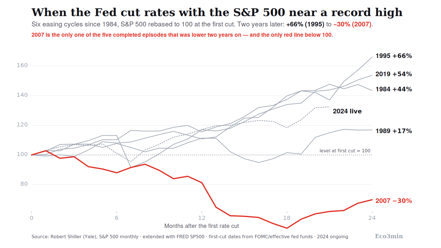
A second pattern cuts against the recession-equals-top intuition. A recession began within two years of the first cut in three of the five episodes — 1989, 2007 and 2019 — yet in two of those three (1989 and 2019) the index was still higher 24 months after the cut. The 1990 recession produced a sub-20% equity dip that recovered; the 2020 recession produced a violent crash that recovered within months. Only in 2007 did the downturn and the equity top coincide into a deep, durable loss. The presence of a recession, in this sample, did not by itself mark the high.
Cutting rates into a record has historically said little about the next two years: the same configuration preceded both 1995’s +66% and 2007’s collapse.
What the record does not settle
Three qualifications bound any conclusion drawn here, and they matter more than usual because the sample is small.
The first is sample size. Five completed episodes since 1984 is a count, not a distribution. No ratio computed on five observations — “one in five,” “two in five” — survives a statistician’s scrutiny as a probability. The honest object is the list itself: six dated cases and what followed each, read individually, rather than a headline frequency. The episodes also span very different regimes. The 1984 and 1995 cuts came with disinflation underway and valuations moderate; 2007 came with a credit system already seizing and housing rolling over; 2019 came with trade tensions and a manufacturing slowdown, not a financial imbalance. Pooling them assumes a homogeneity the macro backdrop does not support. In depth: the long swings of dollar strength.
The second is the asymmetry of the one failure. Even granting that the index rose two years out in four of five cases, the single exception was not a modest one. The 2007 episode ran into the deepest equity decline of the post-war era, with the S&P 500 losing roughly 57% peak-to-trough on a closing basis (S&P 500 closing series). A distribution in which four outcomes cluster between +17% and +66% and the fifth is a near-halving is not well summarised by its median. The tail dominates the risk even when it is rare.
The third is the classification itself. Whether 1990 “counts” as a major drawdown depends on a one-tick definitional choice — −19.9% on closing prices, −20.4% intraday. Whether the 2020 crash should be attributed to the 2019 easing at all is questionable: a pandemic is an exogenous shock the market had not priced when the cut was delivered, and on that reasoning only 2007 represents a drawdown traceable to the cyclical setup the cut responded to. These are stated criteria, not hidden ones, and a reader applying a different rule will land on a different count. That sensitivity is the point: the comfort of a clean “X-for-X” record, of the kind a yield-curve inversion offers, is not available here. A record is a description of the past, not a forecast. Also relevant: the chronology of monetary plateaus.
Where the current cycle sits
This section locates the present cycle within the historical table. It describes what has happened, not what will; the dispersion above is precisely the reason the pattern carries no signal about the path ahead.
The Fed began cutting in September 2024 with the S&P 500 at a record — a textbook “cut into strength,” the tightest possible reading of the definition used here. Twelve months on, the index was up about 17%, matching the 2019 episode and above the +11% to +16% twelve-month outcomes of the 1984, 1989 and 1995 cuts. Along the way it absorbed a drawdown that reached roughly −19% on a closing basis in 2025 without crossing the 20% line, then recovered to new highs. On the journey-versus-destination split that organises this study, the cycle so far resembles the milder members of the set rather than 2007 — but its 24-month window does not close until late 2026, and the table records outcomes, not projections.
The more useful question is structural rather than directional: which regime does the current setup belong to? The 1995 path and the 2007 path were separable in hindsight by the state of credit, valuations and the labour market, not by the fact of the cut. Eco3min’s reading of the current regime, updated as the data arrive, sits closer to the soft-landing template than to a credit-driven unwind — but that is a reading of conditions, not a claim about the index. The cut tells you the Fed is easing; it does not tell you which two-year path you are on. The regime around the cut, not the cut itself, is what separates the two paths — the distinction at the heart of the pillar devoted to monetary regimes.
Methodology
An episode qualifies as a “cut into strength” when the first reduction of a sustained Fed easing cycle occurs with the S&P 500 within 5% of its trailing all-time high (monthly data). The 5% bound captures “near a record” without reaching the conventional 10% correction threshold; the count is reported at 3%, 5%, 7% and 10% so the sensitivity is visible — the central finding (2007 as the only 24-month loser) holds across them. Episodes are identified mechanically across every easing cycle since 1971, not hand-picked: a sustained easing requires the policy rate to be materially lower six months later, which excludes brief mid-tightening dips such as early 1981.
The rule excludes cuts delivered after the market has already fallen, because those belong to a different population — reactive easing into weakness rather than easing into strength. On that basis September 1998 (the index roughly 12% below its high when the Fed cut for LTCM) and January 2001 (the dot-com decline already under way, roughly 10% down) are excluded; both were cuts into a market already rolling over.
Index levels and forward returns use Robert Shiller’s monthly S&P 500 series (Yale), extended past mid-2023 with the daily S&P 500 (FRED) averaged to a monthly frequency; the two series match to the cent across their overlap. Real returns are deflated by the headline CPI (BLS via FRED). Drawdowns are measured peak-to-trough on a closing basis within the 24-month window, with the intraday figure noted where it changes the bear-market classification (1990) and the daily series used where a flash crash makes a monthly average understate the move (the 2020 decline reads −34% on daily closes against roughly −19% on monthly averages). First-cut dates from 1994 onward are FOMC decisions; before 1994 the Committee did not announce moves, so 1984 and 1989 are dated from the operating-target and effective-rate record. Reference release: the Federal Reserve’s history of FOMC target-rate decisions. Every figure on this page is computed from the underlying series; the dataset is downloadable below. Directly related: our note on the institutions and rate cycles behind monetary policy.
Frequently asked questions
What has historically happened to the S&P 500 when the Fed cut rates near a record high?
Across the five completed episodes since 1984, the index was higher two years later in four of them, with a median price return near +43% and a range from +66% (1995) to −30% (2007). Two of the five saw a drawdown exceeding 20% along the way. The outcomes are widely dispersed rather than clustered around a typical result.
Is a Fed rate cut a bullish signal for stocks?
On the two-year horizon, cuts delivered near record highs have more often than not been followed by higher prices. But the same starting point preceded both the strongest outcome in the sample (1995) and the deepest equity decline of the post-war era (2007), so the cut on its own has not distinguished between those paths. The historical record describes a dispersion, not a reliable direction.
How is “cutting into a rising market” defined here?
As the first cut of a sustained easing cycle delivered with the S&P 500 within 5% of its all-time high. Cuts begun after the market had already fallen more than 10% — September 1998, January 2001 — are treated as reactive easing into weakness and excluded, because they belong to a different population of episodes.
Did a recession always follow a cut into highs?
No. A recession began within two years of the cut in three of the five completed episodes (1989, 2007, 2019). In two of those three the index was nonetheless higher 24 months after the cut, because the associated equity declines — the sub-20% dip of 1990 and the V-shaped crash of 2020 — recovered. Only in 2007 did the recession coincide with a deep, durable equity top.
How does this differ from the “Fed pause” question?
A pause is the Fed holding rates after a hiking cycle ends; this study concerns the first actual cut delivered while equities are near a high. They are different policy actions and different sets of episodes. The companion analysis of Fed pauses covers the holding case.
Data
The full episode dataset — one row per cycle, with distance to the prior high, forward returns at six, twelve and twenty-four months (nominal and real), maximum 24-month drawdown, and recession and top flags — is available as a CSV under a Creative Commons Attribution 4.0 licence.
Download the dataset (CSV, CC BY 4.0)
Related
- every Fed pause since the early 1970s — the holding case, where the Fed stops hiking rather than cuts
- the full history of 2s10s yield-curve inversions and their lead time to recession
- how the federal funds rate has moved across cycles
- the dating and depth of US recessions
Last updated — 19 September 2026
Disclaimer – Financial Information: The analyses, commentary, and content published on eco3min.fr are provided for informational and educational purposes only. They do not constitute investment advice or a solicitation to buy or sell financial instruments. Past performance is not indicative of future results. All investment decisions involve risk and are the sole responsibility of the reader.