
How to Invest in Dividend Stocks: A Screening Grid, Not a Stock List
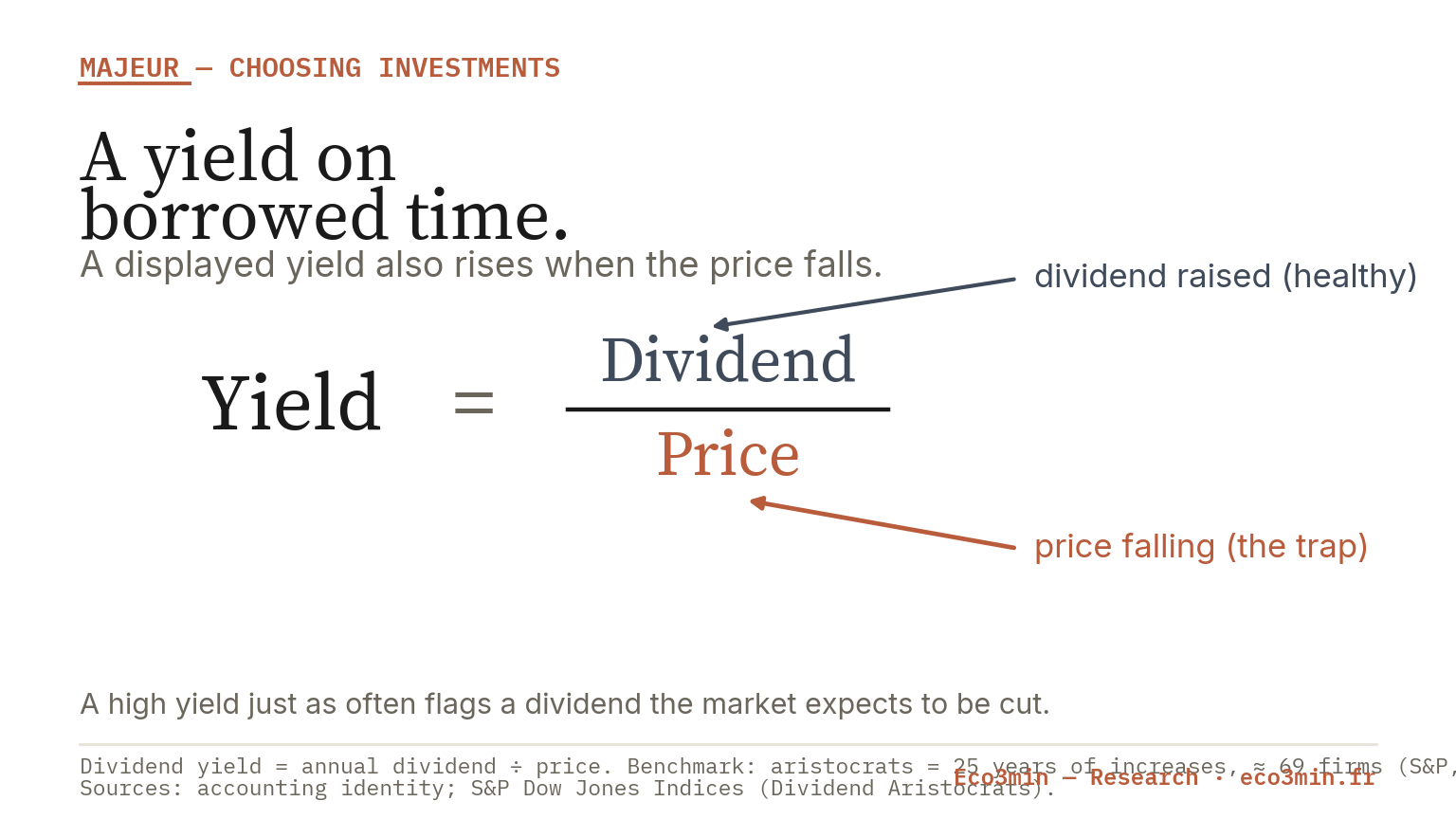
“Best dividend stocks” is a question about criteria, not a list of names: a dividend’s quality is observable, and the highest yields are often the least safe.
- The observable markers are the payout ratio, free-cash-flow coverage and the length of the dividend-growth record, not the headline yield.
- The S&P 500 Dividend Aristocrats index holds companies that have raised dividends for at least 25 consecutive years, about 69 names at its January 2025 rebalancing, and it is equal-weighted.
- An unusually high yield often signals a numerator under strain: a price that has fallen because the market expects the dividend to be cut.
The highest yields are often dividends on borrowed time. Choosing dividend stocks is not about ranking the biggest payers but about reading the quality of the payout, and the same criteria let you read a single stock or a dividend fund.
Screeners promise a top five by yield. That number is the trap, not the answer. A dividend is a claim on a company’s cash, so its durability is what matters, and durability is observable in the payout ratio, the cash coverage and the growth record. This page sets out those criteria and the yield trap they guard against.
“Best dividend stocks” is a question about criteria, not names
There is no ranking that answers “the best dividend stock”, because the label collapses two very different things: a high current yield and a durable, growing payout. The first is a number printed today; the second is a property of the business that has to be assessed. A screener sorted by yield surfaces exactly the stocks most likely to disappoint, because an elevated yield is often the market’s verdict that the dividend is at risk. The useful question is not who pays the most but whose payout is most likely to survive and grow, and that is a question about criteria you can check, placed inside the wider menu of income choices in the sub-pillar on choosing an income vehicle by regime.
A dividend’s quality is observable
The reassuring fact about dividend investing is that quality leaves a paper trail. Three markers, all published, tell you more than any yield ranking, and each answers a different question: can the company afford the dividend, does it pay it from real cash, and has it proved it can keep raising it. Read together, they separate a durable payout from one living on borrowed time, which is the whole discipline reduced to three numbers.
Payout ratio and free cash flow coverage
The payout ratio is the share of earnings paid out as dividends: a low ratio leaves room to keep paying through a bad year, while a ratio near or above 100% means the dividend consumes everything the company earns, with no cushion. The sharper test is free-cash-flow coverage, because earnings can be an accounting figure while cash is not: a dividend covered by free cash flow is paid from money the business actually generated, whereas a dividend that exceeds free cash flow is being funded by debt or asset sales, which cannot last. When a payout is described as safe, this is what safety means in practice, cash coverage rather than a reassuring name, and it is the first thing to read before any yield.
The two markers work as a pair because each catches what the other misses. A payout ratio can look comfortable on reported earnings while the underlying cash is thin, if earnings are flattered by non-cash items; conversely, a high payout ratio in a stable, capital-light business can be perfectly sustainable. Free-cash-flow coverage resolves the ambiguity by anchoring the test in cash actually generated after the spending the business needs to keep running. Read together, they answer a single question the yield cannot: is the dividend a distribution of surplus, or a promise the company is straining to keep. A dividend consistently covered by free cash flow, with a payout ratio that leaves headroom, is the profile that survives a downturn; the opposite profile is the one that produces the cut the market was already pricing.
Dividend growth history: aristocrats and kings as index facts
A long record of rising dividends is the third marker, and it has been codified into index definitions worth knowing. The S&P 500 Dividend Aristocrats index measures S&P 500 companies that have increased their dividend every year for at least 25 consecutive years, held about 69 names at its January 2025 rebalancing, requires a minimum float-adjusted market cap and trading volume, and is equal-weighted so no single mega-cap dominates. The Dividend Kings, an unofficial designation, apply a stiffer 50-year test without the S&P 500 requirement. These labels are facts, not recommendations: a 25-year streak is a filter that has already screened for cash-flow durability across multiple cycles, which is why the aristocrat index skews toward consumer staples and industrials and away from technology, and why the record itself, more than the yield, is the signal to read. The same logic scales up to a fund, discussed in the total-return context of dividends, buybacks and total yield.
Two features of the aristocrat rule are worth drawing out, because they explain its character. First, the equal weighting matters: unlike a cap-weighted index where the largest names dominate, the aristocrat index gives each constituent a similar slice, so a single stock’s stumble does not swing the whole, and the index behaves like a broad basket of durable payers rather than a bet on a few. Second, the 25-year screen imposes a sector shape rather than choosing one: because staples, industrials and healthcare are the businesses most able to raise a dividend through recessions, the index is structurally overweight those sectors and underweight technology, which pays little in dividends. That tilt is the source of the aristocrat’s lower-volatility reputation and, in a technology-led rally, of its tendency to lag. The record also carries a broader lesson about total return: dividends have historically contributed a large share, on the order of roughly a third, of the S&P 500’s long-run total return, which is why the durability of the payout, not its size today, is the part worth screening for.
Dividend ETFs: methodology families
A dividend ETF’s behaviour is decided by its index methodology, not its name, and two families sit at opposite poles. A high-yield screen selects the highest-yielding stocks and weights toward yield, which maximises current income but tilts the fund toward the very companies whose yield is high because their price has fallen, importing the yield trap at the portfolio level. A dividend-growth screen instead selects for a long record of rising payouts, like the aristocrat rule, which lowers the headline yield but raises the odds that the income grows and survives. Reading a dividend ETF therefore starts with one question: does it screen for yield or for growth, because that single choice sets its risk, its sector tilt and its behaviour in a downturn far more than its ticker or its fee.
The other observable is concentration and sector tilt, which follows from the screen. A high-yield fund often concentrates in a few sectors, historically utilities, energy and, at times, real estate, so it carries a sector bet alongside the income; the REIT case, where a high yield sits atop genuine capital risk, is treated in REIT dividend yield and capital risk. An equal-weighted growth screen spreads the holdings more evenly. Neither is better in the abstract; they are different instruments, and the factsheet, not the name, tells you which one you are holding.
Two further observables round out the reading of any dividend fund. The expense ratio matters more for an income strategy than for a growth one, because fees are paid out of the same distributions the fund exists to deliver, so a high fee is a direct tax on the income. And the rebalancing rule shapes what you actually hold over time: an aristocrat-style index reviews membership once a year and drops any company that fails to raise its dividend, which mechanically removes the cutters, while a pure high-yield screen can keep buying into falling names as their yield rises. The screen, the fee and the rebalancing rule together, all printed in the factsheet, describe a dividend ETF far better than any label on its cover.
The yield trap
The yield trap is the single idea that reorganises everything else. A dividend yield is the annual dividend divided by the price, so a yield can rise for two opposite reasons: the company raised its dividend, or the price fell. When the price fell because the market expects the dividend to be cut, the high yield is not income waiting to be collected but a warning the screener has mistaken for an opportunity. The realised income then falls short of the headline, and often the cut arrives, so the buyer captures neither the yield nor the price. Recent history supplies the pattern: companies that had raised dividends for decades, and were removed from the aristocrat index in 2024 after cutting, showed a rising yield in the months before the cut, precisely the trap the number sets. The mechanics of why a stressed numerator dilutes the realised return are developed in buybacks and net shareholder yield.
The yield trap, made visible
The tool below applies the mechanics. Set a displayed yield, a dividend-growth rate that can be negative, and a horizon, and it shows the cumulative income and the effective average yield the position actually delivers. A high yield that shrinks each year settles well below its headline; a lower yield that grows can overtake it. It uses generic mechanics, names no stock, treats the growth rate as a sensitivity rather than a forecast, and picks no winner.
[eco3min_yield_trap_sim lang=”en”]Taxes: qualified versus ordinary dividends
Tax changes the net, and for a US investor the dividing line is between qualified and ordinary dividends. Qualified dividends, paid by US corporations and many foreign firms on shares held long enough, are taxed at the lower long-term capital-gains rates of 0%, 15% or 20% depending on income; ordinary (non-qualified) dividends, including most REIT distributions, are taxed at the higher ordinary-income rates. Two positions with the same headline yield can therefore deliver very different net income depending on which bucket their dividends fall into and the account that holds them, a distinction detailed in qualified versus ordinary dividend tax. The practical point is that yield is a pre-tax number, and the comparison that matters is after-tax.
A high dividend yield reads as high income. It just as often signals a falling price that expects a cut, so the headline yield overstates what the position will actually pay. Read the payout ratio and cash coverage before the yield.
Buybacks: the other channel
A dividend is only one way a company returns cash; the other is the buyback, and ignoring it distorts the comparison between dividend payers. A buyback returns cash by reducing the share count, lifting per-share figures without a taxable distribution, so a company that returns most of its cash through buybacks can look like a poor dividend payer while returning as much to shareholders as a high-yield name. The combined measure, total shareholder yield, adds the dividend yield and the net buyback yield, and it is the fairer basis for comparison, set out in the sub-pillar on total shareholder yield. The choice between the two channels, and what it signals, is examined in buybacks as the other channel and, mechanically, in how buybacks return cash.
This is also why a dividend is not free income. Paying a dividend transfers cash out of the company, and the share price adjusts down by roughly the dividend on the ex-date, so the payout is a portion of total return crystallised as cash, not an addition on top of it. A durable, growing dividend is a signal of a healthy business and a real component of long-run return; a high yield chased for its own sake is often that return borrowed from the price.
The buyback channel also carries its own trap, the mirror of the yield trap. A company can flatter its per-share figures by buying back stock funded with debt rather than surplus cash, which lifts earnings per share without any improvement in the business and leaves a weaker balance sheet behind. So the same discipline that reads a dividend’s cash coverage applies to buybacks: a repurchase paid from free cash flow returns real value, while one financed by borrowing is closer to financial engineering than to a return of capital. Net buyback yield, which subtracts new share issuance from repurchases, is the honest figure, because gross buybacks that merely offset shares handed to executives return nothing to outside holders. Total shareholder yield only works as a comparison when both the dividend and the buyback are read for quality, not just for size.
The criteria, side by side
The grid reduces the choice to what you can actually observe before buying. Read it top to bottom: the yield is the last line, not the first.
| Criterion | Why it matters | How to observe it | The trap |
|---|---|---|---|
| Payout ratio | Room to keep paying through a bad year | Dividends divided by earnings, published | A ratio near or above 100% has no cushion |
| Free-cash-flow coverage | The dividend is paid from real cash | Dividend versus free cash flow | Paid from debt or asset sales, not cash |
| Dividend-growth record | Proven durability across cycles | Years of consecutive increases; index membership | A single cut ends a decades-long streak |
| Displayed yield | Current income, pre-tax | Annual dividend divided by price | High because the price fell, expecting a cut |
The grid is not a ranking and names no stock. It is the sequence a durable-income reader applies before looking at the yield at all, and its wider placement against the full range of investments sits in the sub-pillar on dividends among the broader investment menu, read inside dividends within a broader allocation.
Dividends read through the macro regime
Whether dividend stocks help or hurt depends on the macro regime, and inflation is the key axis. A fixed or slowly growing dividend loses real value when inflation runs high, so the question of whether dividend payers protect purchasing power has a specific answer that depends on whether the dividend grows faster than prices, examined in do dividend stocks resist inflation and, at the level of real versus nominal income, in a dividend’s real versus nominal return. Where the setting sits now is shown on the dashboard for the prevailing macro regime, and the case where suppressed real rates and inflation coincide, which reshapes the appeal of income, is mapped in the Atlas on the financial-repression regime.
Two references complete the picture. How income and value strategies behave across different regimes, so a dividend tilt can be placed rather than assumed, is the tool comparing how assets behave across regimes. And the long-run level of the market’s own dividend yield, the backdrop against which any single yield looks high or low, is the series behind the S&P 500 dividend yield dataset. Read together, the criteria and the regime turn “best dividend stocks” from a ranking into a question the reader can answer for their own holdings.
The regime reading also sets a reference the yield trap needs. A single stock’s 5% yield means little without the market’s own yield as a yardstick: when the broad index yields around 1.5%, a 5% payer is either a genuinely higher-income business or a distressed one, and the criteria decide which. In a financial-repression setting, where policy holds real rates low, income becomes scarce and yield-chasing intensifies, which is precisely when the trap catches the most buyers. The discipline this page argues for, read the payout ratio and cash coverage, check the growth record, judge the tax and the total shareholder yield, and only then look at the yield against the market’s own, is what keeps a scarcity of income from turning into a portfolio of dividends on borrowed time.
A dividend’s durability is observable in its payout ratio and cash coverage; the headline yield is the last thing to read, and the highest yields are the ones to read most carefully.
Frequently asked questions
What makes a dividend’s quality observable?
Three published markers: the payout ratio (dividends as a share of earnings, where a low ratio leaves a cushion), free-cash-flow coverage (whether the dividend is paid from real cash rather than debt), and the dividend-growth record (years of consecutive increases, codified in indices like the Dividend Aristocrats). Together they tell you whether a payout can survive and grow, which the headline yield cannot. Quality is a set of numbers to read, not a name to trust.
How do high-yield and dividend-growth index screens differ?
A high-yield screen selects and weights toward the highest-yielding stocks, maximising current income but tilting toward companies whose yield is high because the price fell. A dividend-growth screen, like the 25-year aristocrat rule, selects for a long record of rising payouts, lowering the headline yield but raising the odds the income grows and survives a downturn. The screen, not the fund’s name, sets its risk, its sector tilt and its behaviour, so it is the first thing to read in any dividend ETF.
What is the yield trap?
The yield trap is when a high dividend yield reflects a falling price rather than generous income. Because yield equals dividend divided by price, a price that drops on fears of a cut mechanically raises the yield, so a screener sorting by yield surfaces the stocks most likely to cut. The realised income then falls short of the headline, and the cut often follows, so the buyer captures neither the yield nor the price. It is why the yield is read last, after the payout ratio and cash coverage.
How are qualified and ordinary dividends taxed?
Qualified dividends, paid by US and many foreign corporations on shares held long enough, are taxed at the lower long-term capital-gains rates of 0%, 15% or 20% by income band. Ordinary (non-qualified) dividends, including most REIT distributions, are taxed at higher ordinary-income rates. Two positions with the same yield can deliver different net income depending on which bucket applies and the account holding them, so the comparison that matters is after-tax, not the pre-tax headline.
A buyback returns cash by cutting the share count instead of paying it out, lifting per-share figures without a taxable distribution. Total shareholder yield adds the dividend yield and the net buyback yield, giving a fairer comparison than the dividend alone: a company returning most of its cash through buybacks can match a high-yield payer while showing a low dividend yield. Judging dividend payers on the dividend alone therefore understates how much some companies actually return.
This content is published for information only. It is not investment advice, recommends no stock, fund or allocation, and names no security. Index definitions and constituent counts reflect S&P Dow Jones Indices data available in 2026 and change at each rebalancing; the Dividend Aristocrats count was about 69 at the January 2025 rebalancing. Tax rates are current US bands and change with law. Sources: S&P Dow Jones Indices (Dividend Aristocrats methodology and constituents); IRS (qualified versus ordinary dividend treatment).
Last updated — 8 July 2026
Disclaimer – Financial Information: The analyses, commentary, and content published on eco3min.fr are provided for informational and educational purposes only. They do not constitute investment advice or a solicitation to buy or sell financial instruments. Past performance is not indicative of future results. All investment decisions involve risk and are the sole responsibility of the reader.