Which Inflation Regime Rewards Which Protection

Cost-push or demand-pull, brief or lasting: each combination has historically rewarded a different protection, and it is the path of real rates it triggers that settles the ranking.
TL;DR
A single inflation episode can travel across the grid's four cells as its supply and demand shares shift, so the map's value is to locate where a regime is heading.
- San Francisco Fed decompositions over 2021-2024 found a supply share dominant early in the episode and a demand share rising later, so the protection that worked at the start no longer worked at the end.
- The inflation breakeven, the gap between a nominal and an inflation-linked bond of the same maturity, is one of the few daily-readable signals of whether the market is moving from a transitory to a persistent diagnosis.
- Because an episode can begin cost-push and turn demand-pull, or be met with tolerance before tightening, a single inflation can cross several of the grid's four cells over its life.
This page does not re-explain how each type of inflation forms. It sets the umbrella’s grid: for each regime, the protection that held, and the one that disappointed.
Naming the regime before choosing the protection
An inflation figure, taken alone, does not tell you which protection worked. Two episodes posting the same rise in prices can have rewarded opposite assets, because what matters is not the level but the regime driving it. Before comparing gold, inflation-linked bonds or property, the inflation at hand has to be qualified. That is what protection depends on the regime sets out as a general thesis. This page builds its operational grid.
Qualifying a regime takes two readings, then a third that settles it. The first two describe the nature of the inflation: its cause and its likely duration. The third describes the response it triggers, and that is what determines the path of real rates, hence the real return of each protection. The grid below follows this order, because it is the order in which regimes are told apart.
Two axes to qualify inflation
Cost-push or demand-pull
Cost-push inflation arises from rising production costs: energy, inputs, logistics. Prices rise even if demand weakens, which complicates the monetary response. Demand-pull inflation arises from an excess of purchasing power over productive capacity, and calls for more direct tightening. The detailed formation of these two logics, their mechanisms and their indicators, belongs to cost-push versus demand-pull. What matters here is their consequence for protections.
The distinction is not binary in practice: a single episode blends the two shares, and their weight shifts over time. The Federal Reserve Bank of San Francisco’s decompositions over 2021 to 2024 measured a dominant supply share early in the episode, then a gradual rise in the demand share. This internal shift explains why what protected early in the cycle no longer protected at the end: an asset set for supply-driven inflation does not react like one set for demand-driven inflation, because the monetary response differs.
Transitory or lasting
The second axis sets a burst that fades on its own against a regime that settles in and anchors expectations. The nuance governs the scale and duration of the monetary response: inflation judged transitory does not call for the tightening that persistent inflation requires. The structural distinction between the two, and the difficulty of telling them apart in real time, belong to structural versus cyclical inflation. For the protection grid, the point to keep is this: the more inflation is judged lasting, the more the monetary response weighs on the path of real rates, and the further the ranking of protections drifts from the “real assets” reflex.
Reading this axis in real time is the hard part. One indicator often underused by savers is the inflation breakeven, the gap between the yield of a nominal bond and that of an inflation-linked bond of the same maturity: it measures the inflation the market expects, and its trajectory signals the expected persistence. When breakevens rise durably, the market moves from a “transitory” diagnosis to a “persistent” one, and prices in the monetary response before it is announced. It is one of the few signals that can be read daily, where the transitory or lasting character of inflation often confirms only after several quarters.
The variable that settles it: the path of real rates
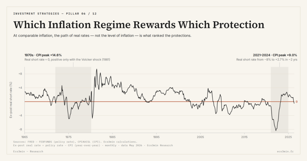
The two axes orient, but they do not suffice. What truly separates the protections is the monetary policy response and the real-rate path it draws. The real rate, the nominal rate adjusted for expected inflation, sets the opportunity cost of holding a non-yielding asset and the market value of rate-sensitive assets. The same inflation regime accompanied by real rates held negative does not rank the protections the way the same regime followed by a tightening that pushes real rates positive does. More on this: The Eco3min study of which bond ETF for the rate regime.
This is why qualifying inflation by its first two axes must always extend into a reading of the monetary response. A cost-push inflation can be met either with monetary tolerance, which leaves real rates negative, or with tightening, which pushes them positive. Both configurations carry the same name but reward opposite protections. The full regime is therefore not “cost-push inflation” alone, but “cost-push inflation with such-and-such a real-rate path.”
The map: which regime rewarded which protection
Crossing the nature of inflation with the path of real rates, four main configurations emerge, each tied to a historically observed protection behaviour. The map that follows describes those past behaviours. It does not prejudge the regime to come.
Cost-push inflation with durably negative real rates. This is the configuration of the 1970s. Real and non-yielding assets protected, because the opportunity cost of holding them was nil, while equities stagnated in real terms and long bonds suffered from rising nominal rates. Background: our investment frame anchored to the cycle diagnosis. The observed winners:
- gold and real assets, supported by the absence of opportunity cost;
- commodities, driven directly by the supply shock;
- nominally-anchored savings, losing in real terms as long as credited rates stayed below inflation.
High inflation with real rates turned positive again. This is the configuration of 2021 and 2022, where the fastest tightening since the Volcker era reversed the real-rate path. The ranking flipped relative to the previous case, at a nominal inflation that was nonetheless comparable. The observed behaviours:
- interest-bearing cash, a real protection again once short rates exceeded inflation;
- gold and long bonds, linkers included, disappointing against rising real rates;
- equities, under short-term pressure from multiple compression.
This opposition between two regimes with an identical nominal diagnosis is the clearest illustration of the grid. It is handled series by series in the opposite regimes of the 1970s and 2022.
A transitory burst with no strong monetary response. When inflation recedes on its own and rates are not durably raised, the trade-off between “active” protections and nominally-anchored savings loses its edge: the real erosion stays limited and temporary. The costliest protection, in this configuration, is often overreaction, which tips savings into assets set for a regime that does not arrive. The error then lies not in the choice of asset but in the duration diagnosis: having treated a passing burst as a settled regime. The cost materialises when inflation recedes and the assets bought to hedge it, valued at the height of the alarmist diagnosis, pull back in turn. For context: the inflation-regime reading of savings protection.
A persistent regime with durable tightening. When inflation settles in and calls for a prolonged restrictive policy, the assets most sensitive to real rates, long bonds and property, reprice the most, while short-duration and short-rate instruments cushion the shock. This is the regime where the cost of mistiming becomes highest, because the transition is most pronounced.
These four cells are poles, not boxes. Real episodes rarely sit cleanly in one: an inflation can begin cost-push and turn demand-pull, or be met with tolerance before tightening arrives, so that a single episode travels across cells over its life. The map’s value is therefore less to assign a label than to locate movement, to see which cell an inflation is drifting toward as its supply and demand shares shift and as the monetary response hardens. Read this way, the grid is a compass rather than a classification: it points to the protection consistent with where the regime is heading, not merely where it started.
A cross-cutting reading emerges from these four cells: each time, the variable that predicts the ranking is not the inflation level, but the sign and path of real rates. The grid is not a list of assets “good against inflation,” it is a correspondence between regimes and historically observed behaviours. It is read by crossing it with the macro cycle, which choosing by the macro cycle extends.
- Qualifying inflation takes three readings: its cause (cost-push or demand-pull), its likely duration (transitory or lasting), and above all the monetary response that sets the path of real rates.
- Two regimes with identical nominal inflation but an opposite real-rate path have historically rewarded opposite protections.
- The variable that predicts the ranking of protections is the sign and path of real rates, not the level of the rise in prices.
- The map describes past behaviours by regime. It does not predict the next regime.
A grid, not a recipe
The regime-by-regime map designates no asset as protective in the abstract. It says what held in each historical configuration, provided the configuration in progress was correctly identified. It is the reading axis of the whole umbrella: the pages that follow instance it, one on the nominally-anchored family, another on the comparison of two regimes, the last on the risk of a shift. All share the same grammar: you do not choose a protection against inflation in general, you choose it against a regime, knowing that it can change. The grid does not remove the uncertainty of reading the regime, but it places that uncertainty where the analytical effort actually pays.
Last updated — 12 July 2026
Disclaimer – Financial Information: The analyses, commentary, and content published on eco3min.fr are provided for informational and educational purposes only. They do not constitute investment advice or a solicitation to buy or sell financial instruments. Past performance is not indicative of future results. All investment decisions involve risk and are the sole responsibility of the reader.
Read next
Full pillar →Beneficiary Designations, the Step-Up in Basis, and the 10-Year Rule: How US Accounts Transfer at Death
At death, most US financial accounts pass outside the will, straight to a named beneficiary, under tax rules…
The Fee Stack in Variable Annuities: M&E Charges, Riders, and Subaccount Costs
A variable annuity does not carry one fee, but a stack of them. Mortality and expense charges, subaccount…
The Conventional 401(k)-Match-First Funding Order: Where It Comes From, How It Works
The question of what order to fund accounts in usually draws a fixed list, presented as a rule…