
Which bond ETF for the rate regime

A bond ETF has no fixed behaviour: the same exposure can cushion a portfolio or erase several years of income, depending on whether real rates rise, plateau or fall. The rate regime decides, not the product.
TL;DR
A bond fund's trailing return ranks it by how favourable the past regime was to its duration: the better it looks, the more rate risk it has quietly accumulated.
- Between 2020 and 2023, a long-dated Treasury ETF erased years of coupon as the 10-year real yield (FRED, series DFII10) moved from deeply negative to above 2% — the regime decided, not the fund.
- Spread widening has two distinct sources — deteriorating fundamentals, which persist with the cycle, versus a liquidity squeeze like March 2020, which resolves fast; in stress, downgraded “fallen angels” force mechanical selling by investment-grade-only funds.
This hub reads each major bond category — duration, credit, inflation, exposure wrapper — through a single lens: how it behaves across the rate regime. It maps behaviour; it does not rank products.
Most bond-ETF comparisons rank funds by fee, size and trailing return, as if a fixed-income holding carried an intrinsic quality independent of the moment it is bought. The bond market says otherwise. Between 2020 and 2023, a single long-dated Treasury ETF could erase years of coupon income as real rates climbed: Federal Reserve data (FRED, series DFII10) shows the 10-year real yield moving from deeply negative to above 2% over the period. What decided the outcome was not the fund but the rate regime. This page reads each major bond category — short or long, investment grade or high yield, nominal or inflation-linked — through that single lens: how does it behave as real rates rise, plateau or fall? It describes observed behaviour; it does not name a product to buy. From here, six focused pages take each dimension in turn, and the rest of this hub maps how they fit together. For the broader picture: the regime framework for gold.
Why a bond ETF has no intrinsic quality
The dominant reflex — on retail comparison sites as in much of the wealth press — is to rank bond funds on static criteria: the expense ratio, fund size, the issuer’s standing, and above all the return of the past three or five years. That framing works poorly for a structural reason: a bond fund has no return detached from the level and trajectory of rates. Its past performance is not the signature of management quality but the imprint of the rate regime that prevailed over the measurement window. To read a ten-year bond performance ranking is to read a photograph of the rate cycle, not a measure of the fund.
The 2020-2023 episode made that confusion costly. Through the preceding decade, long bonds had accumulated flattering returns, carried by a continuous fall in rates that mechanically revalued already-issued securities. An investor who in 2021 selected the bond ETF “best ranked” over five years would, in many cases, have bought the exposure most exposed to the turn: long sovereigns, whose rate sensitivity is the highest. When real rates climbed, it was precisely those funds that fell hardest. The static ranking pointed straight at the danger, because it mistook the performance of a bygone regime for a property of the product.
The mechanics of this illusion are worth spelling out, because they recur with every cycle. An already-issued bond sees its market value move inversely to rates: when rates fall, the fixed coupon it pays becomes relatively more attractive than new issues, and its price rises; when rates rise, the reverse occurs. A decade of falling rates therefore generates a decade of latent gains on long bond funds — gains that show up in performance rankings and that the untrained eye reads as a durable quality. But those gains are the exact mirror image of the losses that will materialise if the move reverses. The past performance of a bond fund is not merely a poor predictor of its future performance: in a regime turn, it is often its inverse.
This is why a trailing-return screen, the default tool of comparison sites, is structurally ill-suited to fixed income. A screen that sorts funds by their three- or five-year return ranks them by how favourable the elapsed rate regime was to their duration — which is to say, it ranks them by the very characteristic that determines how much they stand to lose if the regime turns. The better a long bond fund looks on a trailing screen at the end of a falling-rate decade, the more rate risk it has quietly accumulated. The tool does not merely fail to warn; it actively points toward the most exposed holding, dressed as the safest choice. Reading the screen correctly requires inverting its apparent message, which is precisely what most users do not do.
The conclusion is plain: there is no “best” bond ETF in the abstract. There are bond categories whose behaviour is legible — even fairly predictable — once the rate regime is known. A bond is, by construction, a promise of future cash flows discounted at the prevailing rate. When the discount rate changes, the present value of those flows changes, and the magnitude of the move depends on measurable characteristics: maturity, coupon profile, credit segment, indexation. It is those characteristics, not the fund’s commercial label, that drive the reaction. The useful lens is therefore not “which product to buy” but “how does this category behave as real rates rise, plateau or fall”. Companion analysis: the metrics behind a strong ETF.
This page installs that lens. It rests on three independent axes — duration, credit, inflation — to which the practical question of the exposure wrapper is added. Each axis is treated in depth on a dedicated page; the hub describes how they interlock and where each category sits across the spectrum of regimes. The aim is not to produce a ranking, but to make the reader able to read the present situation for themselves.
A bond ETF’s past performance does not measure its quality: it photographs the rate regime that has just elapsed.
The three reading axes: duration, credit, inflation
Reducing a bond holding to a single risk rating misses the point. Three distinct risks coexist in most funds, and they do not respond to the same signals. Conflating them leads to expecting protection an exposure does not provide, or to blaming it for a decline whose cause lies elsewhere. The regime lens separates these three axes to make them intelligible.
The duration axis: sensitivity to rates
Duration measures, in years, how sensitive a bond’s price is to a change in rates. A duration of seven means a one-point rise in yields pushes the price down by roughly 7%, all else equal. It is the most structuring axis, because it governs the amplitude of the reaction: two funds showing the same running yield can move in opposite directions on the same rate shift if their durations differ. The conceptual depth of this mechanics — why duration exists, how it is computed, what it implies in convexity — is carried by a page on how duration governs price sensitivity. The hub retains only the consequence: the longer the duration, the more the fund amplifies rate moves, up and down.
The second engine is credit. A high yield ETF and an investment grade ETF of the same maturity do not track the same signal: the former depends above all on the credit cycle and the risk premium demanded of fragile issuers, the latter remains more governed by rates. This axis is independent of duration: a fund can be short in maturity yet highly sensitive to credit stress, or the reverse. How each segment behaves across the cycle is developed on the page covering high yield and investment grade across the cycle. At the hub level, the consequence fits in one line: when credit tightens, high yield behaves more like an equity than a bond, and the supposed diversification erodes at the worst moment.
The inflation axis: nominal versus linked
The third axis separates nominal securities from inflation-linked ones. Linkers promise to protect the purchasing power of the principal, but this protection is partial and conditional: it covers rising prices, not rising real rates. The page on what inflation-linked bonds actually cover details where the protection operates and where it stops. At the hub level, the key is not to conflate “protection against inflation” with “protection against losses”: a linker can fall in the middle of an inflationary surge if real rates rise faster than the indexation compensates.
These three axes are orthogonal. The same fund can be long in duration, investment grade in credit and nominal in indexation — each characteristic calling for a distinct reading. The strength of the regime lens lies precisely in this decomposition: it allows one to anticipate, not the exact outcome of a fund, but the likely direction and magnitude of its reaction to a regime change. A holder able to identify these three characteristics on their own exposure already commands a reading superior to any performance ranking.
The duration axis: the variable that sets the amplitude
If a single axis had to be kept to read a bond holding by regime, it would be duration. It is the quantitative translation of a simple intuition: the more distant the cash flows a bond promises, the more sensitive its present value is to the rate at which those flows are discounted. The mechanics trace back to the founding work of financial theory — Macaulay (1938) formalised the measure, Hicks (1939) refined its marginal interpretation — and remains today the first reading grid of a bond manager. That axis becomes concrete once applied to actual holdings — via sizing a portfolio’s exposure to interest-rate risk.
The practical consequence is that an ETF’s maturity is no technical detail: it is its first regime lever. A fund of very short bonds absorbs a rate rise essentially as added yield, because its securities mature quickly and are replaced at the new rate; its capital value barely moves. A fund of long bonds, by contrast, takes the revaluation immediately: its distant securities lose present value as the discount rate climbs. The gap in behaviour between these two extremes, and the role of intermediate maturities, is the subject of the page on the gap between short and long maturities.
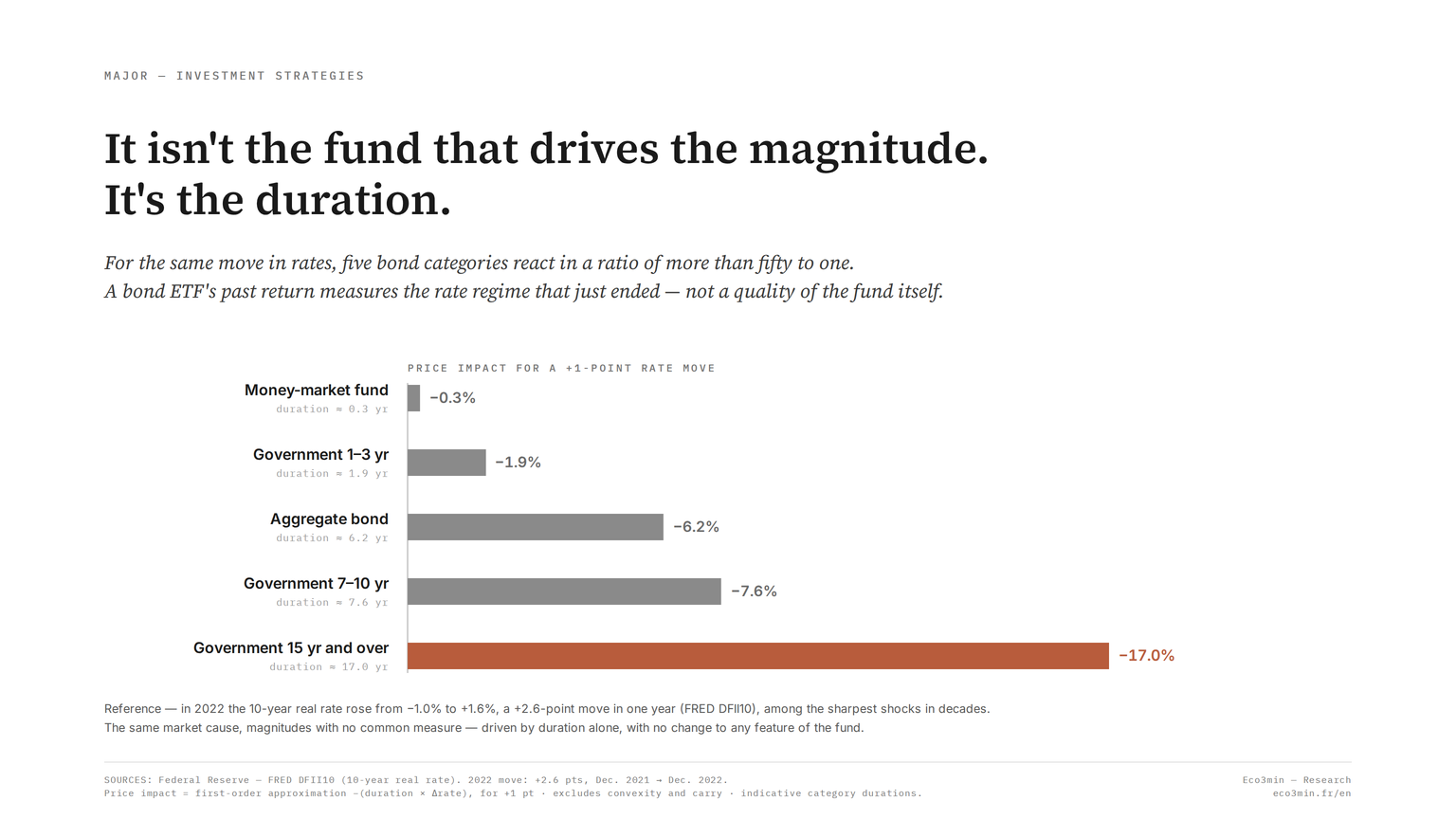
A few orders of magnitude help, and it is worth walking the spectrum of durations. The chart at the top of this page walks it for a single point of rates: a money-market fund of duration 0.3 falls 0.3%, a 1-3 year government fund of duration 1.9 falls 1.9%, an aggregate bond fund of duration 6.2 falls 6.2%, a 7-10 year government fund of duration 7.6 falls 7.6%, and a 15-year-and-over government fund, duration 17.0, falls 17.0%. On an intermediate fund with a duration near eight, a two-point rise therefore translates, to a first approximation, into a price decline on the order of sixteen percent, before the convexity correction that slightly softens the loss on large moves. On long-dated government bonds, whose duration frequently approaches fifteen to eighteen years, the same shock drives a far steeper fall, on the order of thirty percent after convexity, which is what 2022 delivered on the long sovereign indices, one of the worst calendar-year drawdowns recorded on that segment in decades. At the other extreme, a money-market fund with a duration below one sees its capital only marginally dented by the same shock, and quickly offset by the rise in reinvested yield. The same cause — rising rates — produces three results of entirely different magnitude, from duration alone. Convexity, which describes the curvature of the price-yield relationship, adds a nuance in the holder’s favour on large moves, but does not overturn the hierarchy: duration remains the first-order determinant. Further on this: our Q&A on bond convexity.
The 2022 tightening offered a brutal demonstration of this asymmetry. Long government bond indices posted one of their worst calendar-year declines in decades, while money-market and ultra-short funds absorbed rising rates as income rather than capital loss. The same rate shock produced opposite results from duration alone. That is what makes duration central: it does not say whether rates will rise or fall, but it says how violently a given fund will react to the move, whatever it is.
Reading duration by regime amounts to posing a conditional question. In a regime of rising real rates, long duration is the dominant loss factor and short duration cushions. In a plateau regime, running income takes over and the gap in behaviour narrows. In an easing regime — when real rates recede — long duration becomes the most powerful appreciation factor again, by symmetry. The lens prescribes no duration: it describes how each segment behaved in each configuration, so the reader can place their own. See also our overview of bond duration.
Duration has, however, a limit worth stating at the hub level: it captures only sensitivity to the risk-free rate, and stays silent on the other two axes. A fund can show a moderate duration and lose heavily because its issuers deteriorate — that is credit risk, which duration ignores. A linker can carry a high real duration invisible to whoever looks only at the stated maturity. Duration is thus a first-order determinant, but not the only one: it states the amplitude of the reaction to rates, not the totality of the embedded risk. That is precisely why the lens separates three axes rather than aggregating one. Reducing the analysis to duration would mean reading one dimension well while staying blind to the other two, and exposing oneself to declines whose cause would escape the chosen frame entirely.
A “safe” bond fund is often assumed to be a low-volatility one. But a bond fund’s volatility comes first from its duration, not from the quality of its issuers: a fund of long sovereigns, free of default risk, can fall further than a short high yield fund when real rates rise. Conflating the absence of credit risk with the absence of price risk leads to misreading the nature of the holding.
The credit axis: a second engine, independent of duration
Credit introduces a risk of another nature. Where duration measures the reaction to rates, the credit spread measures the premium the market demands to lend to an issuer that might default. That premium varies with the economic cycle and with risk appetite, independently of the level of risk-free rates. An investment grade ETF gathers issuers judged solid, whose spread is narrow and relatively stable; a high yield ETF assembles fragile issuers, whose spread is wide and highly cyclical.
The distinction becomes crucial in stress phases. According to ICE BofA index data, the US high yield spread, which sits between three and six hundred basis points most of the time, peaked at 2,182 basis points in December 2008 and at 1,087 in March 2020, then compressed into recovery. Through those episodes, high yield behaves far more like an equity than a bond: it falls when risk rises, at the precise moment the investor would expect a bond asset to cushion. Investment grade, for its part, retains more of its bond profile, its reaction staying dominated by rates rather than by the default premium. Related coverage: the case for stocks or bonds.
It matters to distinguish two sources of spread widening, because they do not resolve the same way. A widening tied to anticipated economic deterioration — rising expected defaults — reflects worsening fundamentals and can persist as long as the cycle does not turn. A widening tied to a liquidity squeeze, as in March 2020, reflects above all a rush toward the safest assets and tends to resolve quickly once liquidity returns. A holder who conflates the two may read a passing liquidity shock as a durable solvency crisis, or the reverse. The boundary between investment grade and high yield is itself mobile: in a stress phase, downgraded issuers cross the line — the “fallen angels” — which changes index composition and can force mechanical selling by funds constrained to hold investment grade only.
The headline yield of a high yield fund is, for this reason, a treacherous selection criterion. A double-digit yield does not represent return so much as compensation for an expected loss rate: part of it is meant to be eaten by defaults, and the realised return is what remains once those defaults arrive. In a benign credit phase, few defaults materialise and the yield largely flows through; in a turn, the default rate rises and a portion of that headline yield never reaches the holder, while the price falls on top. Comparing a high yield fund and an investment grade fund on yield alone therefore compares two numbers that mean different things — one a near-certain coupon, the other a risk-laden expectation. The credit cycle is what converts the second into a realised figure, and it does so unevenly across phases. Related explainer: our breakdown of the credit cycle.
This dependence on the credit cycle explains why selecting between segments is not a question of “best yield” but of phase. In expansion, the spread compresses and high yield outperforms mechanically, its higher yield not erased by defaults; in a turn, that same higher yield is more than offset by widening spreads and rising expected defaults. How each segment behaves across the credit cycle, distinct from the pure rate effect, is the subject of the dedicated page — which takes care to separate this exposure-selection reading from the macro reading of the spread as a leading recession signal, which belongs to another frame.
At the hub level, the lesson is that an apparently diversified bond portfolio can concentrate a single risk — credit risk — spread across several funds. Holding high yield, emerging-market debt and subordinated debt at once is not diversifying: it is multiplying exposure to the same factor, which will manifest in correlated fashion as soon as the cycle turns. Apparent diversification by the number of lines then masks real concentration by the underlying factor.
The inflation axis: what indexation protects, and what it does not
Inflation-linked bonds carry a promise that is widely misread. They adjust the principal or the coupon to the movement of a price index, protecting the purchasing power of the principal against the general rise in prices. But this protection covers only one risk, inflation, and leaves the other intact, real-duration risk. And the two do not always move together.
2022 illustrated this without ambiguity. With euro-area inflation peaking at 10.6% in October 2022 on the Eurostat HICP annual-rate series, inflation-linked ETFs, OATi on the French side and TIPS on the US side, still fell. The reason lies in the security’s arithmetic: the climb in real rates weighed on the present value of the flows more than the indexation protected purchasing power. A linker remains a bond, endowed with a real duration; when the real rate rises, that security loses value, even in the middle of an inflationary surge. The protection is genuine, but it is conditional on the real-rate regime. The wider context: Physical Gold ETFs vs Gold Miners: Two Exposures, Two Regime Behaviours.
A technical point often deepens the surprise: indices of linked securities are frequently long in maturity, hence carry a high real duration. Many holders buy these funds for their “inflation protection” label without perceiving that they acquire, at the same time, a marked exposure to real duration. In 2022, it was that real duration, not the indexation, that dominated the outcome. Inflation protection lodged in a long vehicle is first, mechanically, a bet on the real rate.
The variable that articulates these two dimensions is the inflation breakeven, the gap between the nominal yield and the real yield of comparable maturity. That breakeven represents the average inflation the market anticipates over the period. It conditions the relative case for a linker versus its nominal equivalent: the linker is advantageous if realised inflation exceeds the breakeven, disadvantageous if it stays below. Put differently, buying a linker is not “protecting against inflation” in the abstract, but taking a position on the gap between future inflation and that already priced in. That breakeven logic, and the limits it imposes on the protection, are developed on the cluster’s dedicated inflation page.
The lesson for the regime lens is that two too-often-fused questions are worth separating: “does this security protect against inflation?” and “does this security protect against losses?”. The answer to the first can be yes while the answer to the second is no, as soon as the inflationary surge is accompanied by a climb in real rates. That is exactly the 2022 configuration, and it is what surprised many linker holders.
The exposure wrapper: two channels for the same underlying
Beyond the three risk axes, a practical question arises, especially in continental Europe: through which channel does one take rate exposure? Two dominant wrappers offer exposure to the same raw material — rates — along opposite logics. The bond ETF tracks an index continuously and absorbs price moves at once, up and down. The French euro fund, the guaranteed-capital account at the heart of French life insurance, smooths returns over time through the insurer’s accounting and reserve mechanism, at the cost of near-zero responsiveness to the rate regime. A complementary angle: the guaranteed-fund / unit-linked trade-off.
This difference in transmission produces sharply contrasting behaviour. After a decade of decline, the average euro-fund return climbed back as insurers rolled their bond portfolios into higher-yielding paper, with a built-in lag: the ACPR puts the average credited rate on individual contracts at 1.3% in 2021, 1.9% in 2022, then 2.6% in 2023 and 2.63% in 2024 as in 2025, net of charges on assets and before social contributions (Analyses et Synthèses no. 180, June 2026). The bond ETF, by contrast, had repriced the rate rise far earlier, as a fall in net asset value in 2022 and then a rise in the yield available at purchase. The same rate move was thus experienced on a delay depending on the wrapper: painful and immediate for the ETF, painless but deferred for the euro fund.
The smoothing mechanism is worth naming, because it explains the inertia. The insurer does not mark its bond portfolio to instantaneous market value to credit the return: it distributes mainly the coupons received and can draw on a reserve built in good years, the profit-sharing provision, to smooth leaner ones. The credited return therefore reflects a historical portfolio, accumulated across years of differing rates, not the rate of the day. This inertia shields the holder from market volatility but deprives them of responsiveness: a euro fund captures a rate rise slowly, at the pace of the renewal of its bond stock. The page on the euro fund versus the bond ETF describes how each reacts as real rates rise, plateau or fall.
The same inertia that delays the euro fund’s response to a rate rise also delays its response to an easing, and the symmetry matters. When market rates fall, the euro fund keeps crediting a return built on its higher-yielding historical stock for some time, appearing to outperform a freshly repriced ETF — until renewal gradually erodes that advantage. The ETF, conversely, takes a rate rise as an immediate loss but also reflects a subsequent easing as an immediate gain. Neither wrapper is faster in some absolute sense; each is fast on the dimension where the other is slow. The euro fund is slow to transmit market moves of either sign to the holder; the ETF is immediate on both. Describing them by regime means tracking not only the direction of rates but the lag with which each channel passes that direction through to the holder’s experience. Further detail: the trade-offs across bond access paths.
The hub refrains from naming a wrapper to favour: the trade-off depends on the regime, the horizon and each individual’s own situation, notably tax and liquidity. The wrapper-mechanics lens extends that same regime-by-regime reading to the container itself. What belongs to description, by contrast, is clear. The euro fund dampens volatility at the cost of an inertia that makes it slow to capture a rate rise; the ETF fully exposes duration, which penalises it in a rate rise but lets it rebuild an attractive running yield quickly. Reading these two wrappers by regime is to understand that their opposition is not a question of quality, but of the speed at which the rate is transmitted to the holder.
A second, structural difference separates the two channels: the nature of access to capital. The bond ETF trades continuously on a market, at a price reflecting the instantaneous value of the underlying portfolio; its value can therefore swing sharply from one day to the next, but it is known and the security is sellable at any time at market conditions. The euro fund guarantees nominal capital and displays no fluctuating market value, but that stability comes with a contractual frame specific to life insurance, with its withdrawal rules, its specific taxation and, in certain extreme market configurations, regulatory provisions that can temporarily frame redemptions. These characteristics make no wrapper superior: they describe two logics of access to capital that the holder reads against their horizon and liquidity constraints. The regime lens does not arbitrate that choice, which depends on each individual’s own situation, but makes legible how each channel behaves against rates. Related work: our read on ETF selection.
Reading each category’s behaviour by rate regime
The lens comes into its own when bond categories are crossed with the three configurations of the real-rate regime: the rise, the plateau, the easing. The description that follows is not a ranking of products to buy, but a reading of each category’s observed historical behaviour in each configuration. It reads as a map, not as an instruction.
A regime of rising real rates
When real rates rise, as between 2021 and 2023, when the US 10-year real yield went from −1.08% on 4 January 2021 to 2.52% on 25 October 2023 (FRED, DFII10), duration becomes the dominant loss factor. Long sovereigns fall hardest; short sovereigns and money-market funds cushion and see their yield at purchase climb. Linkers can fall despite inflation, because the real-rate component outweighs the indexation. Investment grade credit takes the rate hit but holds up better than long sovereigns if its duration is shorter; high yield then depends above all on the economic trajectory — it holds if the rate rise accompanies solid growth, it suffers if it signals a slowdown. The euro fund, through its inertia, crosses this phase almost without visible jolts, capturing the rise on a delay. It is the most dangerous regime for the holder who selected their fund on past performance, since the categories best ranked the day before — typically the long ones — are the most exposed here.
A plateau regime
When real rates plateau at an elevated level, the dynamic changes in nature. Running income becomes the main driver of return again, since price moves fade for lack of a new rate move. Categories with high running income — investment grade credit, high yield in a non-recessionary phase, intermediate bonds — benefit from this carry. Long duration stops penalising without delivering the capital gain an easing would bring. It is the regime where the gap in behaviour between categories narrows most, embedded yield taking precedence over rate sensitivity. For the holder, it is also the least legible configuration in real time, because a plateau is distinguished from a peak preceding an easing only with hindsight.
A regime of easing real rates
When real rates recede, symmetry plays in favour of long duration: long sovereigns become the most powerful appreciation factor, their high sensitivity now amplifying a favourable move. Linkers benefit from the fall in the real rate, independently of inflation. Credit behaves according to the context of the easing: an easing tied to monetary loosening in a growth environment compresses spreads and favours high yield, whereas an easing tied to a flight to quality in recession widens spreads and penalises fragile issuers, to the benefit of sovereigns alone. This bifurcation is essential: not all rate easings are alike, and the same fall in the risk-free rate can be good news for high yield or a disaster, depending on whether it accompanies growth or recession. The euro fund, again through inertia, captures this easing only gradually, its credited return reflecting a historical portfolio.
This regime reading calls for a methodological caveat: it describes tendencies, not certainties. A rate regime is not a pure category; it is recognised better in hindsight than in real time, and transitions between regimes are often the most disorienting phases, because several forces contradict one another. The ten-year yield, tracked through the macro signal in the benchmark sovereign yield, offers a useful marker to place the prevailing regime, without summing it up on its own.
Transitions deserve particular attention, because they are where the lens is most useful and hardest to apply. At the passage from a rising regime to a plateau, then from a plateau to an easing, categories do not switch at the same pace: long duration stops penalising before it starts paying, credit reacts to anticipated growth rather than to the rate alone, and inflation expectations can move ahead of realised inflation. A holder who extrapolates the elapsed regime — who keeps fearing the rise once the plateau is already in place, or who waits for an easing already under way — applies the right lens to the wrong regime. That is where the confusion between past performance and future behaviour costs the most, since the categories most marked by the previous regime are often the first to begin the switch.
The regime lens does not seek to forecast the next rate move — a notoriously uncertain exercise — but to make legible a bond category’s reaction once that move is known. It shifts the question from “which product will perform?” to “how does this category behave in the configuration I am in?”. That shift turns a directional bet into a conditional reading, more robust because it does not depend on a correct anticipation of rates.
The diversification trap: when bonds and stocks fall together
One last dimension escapes the three risk axes but conditions a bond holding’s role in a portfolio: its correlation with equities. The notion that bonds always cushion a fall in equities rests on a negative correlation that is no law. It depends on the inflation regime. In a disinflationary regime — most of 1990 to 2020 — stocks and bonds moved inversely, giving bonds their diversifier status. In an inflationary regime the relationship flips.
The historical reminder is useful, because the generation of investors formed after 1990 grew used to treating negative correlation as a permanent given. It is not: in the 1970s and early 1980s, marked by high inflation, stocks and bonds often fell together, the rate rise weighing on both classes at once. The negative correlation of the following three decades was the product of a particular disinflationary regime, not a structural property of bonds. When the inflation regime changes, the sign of the relationship can change with it.
2022 materialised this flip: both classes fell at once, the S&P 500 and long Treasuries declining together as real rates climbed (FRED data). For a portfolio built on the assumption of automatic bond diversification, the double fall was all the more destabilising for occurring at the moment protection was most expected. The mechanism of this when bonds and stocks fall together — why the sign of the relationship flips with the inflation regime, and in which regimes diversification historically stops working — is the subject of a dedicated page, designed as a reference marker on the question.
The scale of the shift is what made it consequential. A balanced portfolio long built on the premise that government bonds offset equity drawdowns found both legs falling in the same year, removing the cushion at the moment of maximum need. The episode did not invalidate diversification as a principle; it exposed the conditionality of one particular pairing. Bonds remain a diversifier against equities in a disinflationary regime, where a growth shock pushes rates down and bond prices up while equities fall. They cease to be one when the shock is an inflationary rate rise that pushes both prices down together. The lesson is not that bonds stopped working, but that their diversifying property was always a function of the regime, mistaken for a constant during three decades in which that regime happened to hold. Related material: choosing investments in the light of the macro cycle.
At the hub level, this dimension completes the lens: selecting a bond category is not reducible to its behaviour in isolation by rate regime, but includes how that behaviour combines with that of other assets. An exposure that cushions in a disinflationary regime can amplify the fall in an inflationary one. Bond diversification is conditional on the regime, like everything else in the lens.
From the lens to reading the present
The thread running through these five dimensions is single: no bond holding behaves independently of the rate regime. Duration sets the amplitude, credit modulates sensitivity to the cycle, indexation bounds the protection, the wrapper governs the speed of transmission, and correlation determines the role within a whole. Reconstructing these dimensions is to give oneself the means to read a situation rather than wait for a ready-made instruction.
The prevailing real-rate regime can be placed with public markers: the level and trajectory of the real rate, the gap between nominal and real yields that informs on inflation expectations, and the broader macro context that distinguishes a growth easing from a recession easing. These markers, tracked in today’s macro regime dashboard, dictate no decision; they provide the frame in which the behaviours described here become legible. The lens is not meant to replace each individual’s own situation — horizon, taxation, liquidity constraints — but to avoid the initial error: believing that a bond holding carries a fixed quality, independent of the moment.
To go deeper on each axis, the cluster’s six pages take up the thread: the depth of duration, the maturity trade-off, the inflation dimension and its limits, the selection of credit segment by the cycle, the choice of exposure wrapper, and the correlation trap. The whole does not lead to a product to buy, but to a capacity: reading fixed income by the rate regime, and recognising the present configuration for what it is. To place this work in the broader frame of selecting holdings by the cycle, the sub-pillar page on choosing investments across the cycle gathers the building blocks, and the asset-allocation strategies pillar gives the overall perspective.
Frequently asked questions
How can the same bond ETF rise and then fall heavily across periods?
Because its market value moves inversely to rates. During a phase of falling rates, its already-issued securities gain present value and the ETF rises; during a phase of rising rates, the same mechanism runs in reverse. The magnitude of the move depends on the fund’s duration. A long fund can thus post excellent returns over a decade of falling rates, then erase several years of gains in a turn, without any characteristic of the fund having changed — only the rate regime changed.
How does duration differ from a fund’s maturity?
Maturity is the securities’ redemption date; duration is a measure of rate sensitivity that accounts not only for maturity but also for the coupon-payment profile. Two funds of the same maturity can have different durations depending on their coupon structure. It is duration, not raw maturity, that predicts the magnitude of the price reaction to a change in rates. The page on rate sensitivity develops this distinction.
Does an inflation-linked bond protect in every case of rising prices?
No. Indexation protects the purchasing power of the principal against rising prices, but does not protect against a rise in real rates. In 2022, despite high inflation, linker funds fell because the climb in real rates dominated the effect of the indexation. The protection is genuine but conditional on the real-rate regime, and a linker’s relative advantage depends on the gap between future inflation and the breakeven already priced in. A related perspective: Which Inflation Regime Rewards Which Protection.
How does high yield behave when equity markets fall?
Historically, high yield tends to fall alongside equities in stress phases, because both depend on risk appetite and the economic cycle. ICE BofA index data puts the peak of the US high yield spread at 2,182 basis points in December 2008 and at 1,087 in March 2020, simultaneous with equity-market declines. High yield therefore offers limited diversification relative to equities at the moment it would be most useful, unlike quality sovereigns in a disinflationary regime. More context: active management versus passive management, by the data.
Do the euro fund and the bond ETF expose to the same rate risk?
They expose to the same underlying — rates — but transmit that risk to the holder in opposite ways. The ETF reprices rate moves immediately in its net asset value, which makes it volatile but responsive. The euro fund smooths returns over time through the insurer’s reserve mechanism, which dampens volatility but slows the transmission of a rate rise to the credited return. Rate risk is therefore present in both cases; what differs is its speed and visibility to the holder, immediate and apparent for the ETF, deferred and smoothed for the euro fund.
Why can a portfolio of several bond funds be less diversified than it appears?
Because diversification is measured by the number of distinct risk factors, not by the number of lines. Holding several funds all exposed to the same factor — for example high yield, emerging-market debt and subordinated debt, which all depend on the credit cycle — concentrates exposure to that factor while giving the appearance of a spread. In a credit-cycle turn, these funds fall in correlated fashion. Real diversification requires combining exposures whose dominant risk factors differ, distinguishing what stems from duration, credit and indexation.
- A bond ETF has no intrinsic quality: its past performance reflects the elapsed rate regime, not a property of the fund, and can even invert in a regime turn.
- Three independent axes govern bond behaviour — duration (amplitude of the reaction to rates), credit (sensitivity to the cycle), indexation (partial and conditional protection against inflation).
- Duration sets the amplitude: it decides the violence of a fund’s reaction, up and down, independently of the direction of rates.
- A linker’s protection against inflation does not protect it against a rise in real rates: it can fall in the middle of an inflationary surge, as in 2022.
- Bond diversification is conditional on the inflation regime: the stock-bond correlation flips from negative to positive in an inflationary regime, as the double fall of 2022 illustrated.
Last updated — 6 October 2026
Disclaimer – Financial and Legal Information: The analyses, commentary, and content published on eco3min.fr are provided for informational and educational purposes only. They do not constitute investment advice or a solicitation to buy or sell financial instruments. Past performance is not indicative of future results. All investment decisions involve risk and are the sole responsibility of the reader. Data, charts and calculated series are provided as is and may contain errors or lag behind their source: check any figure against the primary source cited before relying on it. Content describing laws, regulations or contracts reflects the law as of its publication date and does not constitute legal or tax advice; applying it to a specific situation requires a qualified legal or tax professional.
Read next
Full pillar →Target-Date Funds vs Self-Directed Portfolios: The Mechanics of a Delegated Glide Path
A target-date fund is sold as a simple, set-and-forget win. It is first something narrower: a delegated glide…
What Guaranteed Savings Products Have Paid: Fixed Annuity and Stable Value Yields Through the Rate Cycle
US guaranteed savings products credit a rate that trails the bond market rather than tracking it. Through the…
Beneficiary Designations, the Step-Up in Basis, and the 10-Year Rule: How US Accounts Transfer at Death
At death, most US financial accounts pass outside the will, straight to a named beneficiary, under tax rules…