The Gold/Silver Ratio: Is the Oldest Precious-Metals Signal Still Reliable?

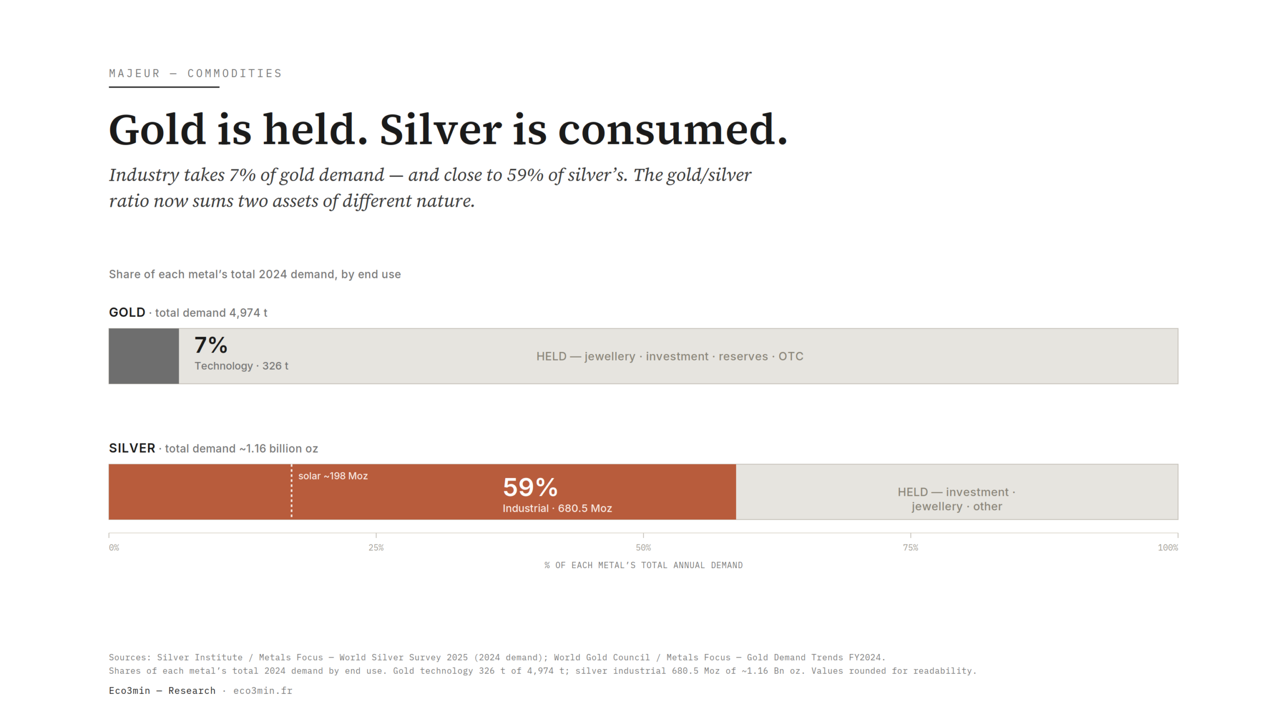
The gold/silver ratio pits two metals long treated as cousins, yet silver now draws close to 60% of its demand from industry, above all solar. That manufacturing half pulls its price away from the monetary register that once made the ratio a valuation gauge.
TL;DR
Gold tracks real yields and the dollar; close to 60% of silver demand now follows the manufacturing cycle, so the gold/silver ratio sums two assets of different nature.
- Set at 15:1 in the 1792 Coinage Act, the ratio has floated since the 1873 demonetisation, ranging 50 to 80 (average near 65) and spiking to nearly 125 in March 2020.
- Industrial demand hit a record 680.5 Moz in 2024, close to 59% of the 1.16 billion-ounce total, with solar alone near 198 Moz and its share of industrial use rising from 11% to 29% since 2014.
- Electronics is silver's biggest industrial outlet, carried by its conductivity; global IT power capacity has risen roughly fiftyfold since 2000, adding AI and 5G demand untethered from the dollar.
If half of silver demand answers to the manufacturing cycle rather than to real rates, the question is no longer the level of the ratio, but what it still measures.
1. What the gold/silver ratio measures, and the promise it carries
The gold/silver ratio answers a disarmingly simple question: how many ounces of silver does it take to buy one ounce of gold? Divide the gold price by the silver price, and the resulting number captures, in a single figure, the relative value of the two metals. It is one of the oldest reference points in commodity markets, predating stock indices by millennia. Ancient civilisations fixed the rapport at roughly 12 to 15 to one; the young American republic set it at 15 to one in the Coinage Act of 1792, and nineteenth-century France, under the Latin Monetary Union, held it near 15.5 to one. Bimetallism rested precisely on the belief that a stable rapport could be fixed by statute.
That system did not survive the reality of mining discovery. When the supply of one metal surged — Nevada silver in the 1870s, for instance — the legal rapport drifted from the market rapport, and Gresham’s law drove the undervalued metal out of circulation. The major powers abandoned monetary silver in favour of the gold standard from the 1870s onward, a demonetisation that silver’s defenders long called the “Crime of 1873” and that triggered a long decline in silver’s price relative to gold. From that point the ratio ceased to be a fixed point and became a variable. The final abandonment of metallic convertibility in the twentieth century freed it entirely: it now floats on the two prices, with no administrative anchor whatsoever. In the same vein: Physical Silver, ETFs or Mining Equities: Three Different Exposures.
Since the start of the twentieth century the ratio has broadly oscillated between 50 and 80, with a long-run average near 65. But it is its extremes that built its reputation. In January 1980, at the height of the silver spike, it fell toward 16 to 20 ounces per one. Methodology detailed in the LBMA gold and silver price benchmarks. Forty years later, in March 2020, at the peak of the pandemic panic, it climbed to nearly 125, an all-time record: it then took one hundred and twenty-five ounces of silver to buy a single ounce of gold. Between those two bounds the ratio spent most of its time far from its average, which it has touched only briefly and rarely since the 1970s. The mean is not an attractor where the rapport comes to rest; it is a statistical midpoint the ratio crosses more than it inhabits.
From this history grew an implicit promise, rarely stated but widely internalised: that the ratio is bounded over the long run and will always return to its centre of gravity. A “high” ratio would signal cheap silver against gold; a “low” ratio, expensive silver. This relative reading has structured generations of precious-metals commentary, down to numerical rules that claim to turn the ratio’s level into a mechanical trading signal. Yet nothing in physics, chemistry or geology obliges the two metals to trade at a given rapport. The number is no natural constant; it is the shifting balance of two distinct markets. It is this mean-reversion mechanic, and its supposed reliability, that this article tests.
Before judging the signal, one must know its raw material. The ratio compares two metals assumed interchangeable in their valuation logic — two stores of value differing only in scale. That assumption of comparability is exactly what deserves scrutiny. For gold and silver are no longer quite two variants of the same asset. To see why, one must first look at silver demand broken down by end use, line by line, rather than relying on the misleading image of “poor man’s gold”.
2. Silver’s dual nature: monetary metal and industrial input
The decisive difference between the two metals lies not in their price but in how the real economy uses them. Gold is, above all, held. Central banks have accumulated it in record tonnages since 2022, in a move to diversify reserves away from the dollar; metal-backed funds store it on behalf of investors; households keep it as jewellery that often doubles as savings. Gold’s industrial demand exists but is marginal against the tonnage hoarded. Gold, for the most part, is not consumed: it changes hands and sleeps in vaults.
This opposition also shows in the relationship between stock and flow, which radically separates the two markets. Gold accumulated over millennia stays almost entirely available: it forms a colossal stock relative to annual mine output, so that variations in new supply shift only marginally a price dominated by that vast hoarded reservoir. Silver, because it is consumed and often scattered in unrecoverable traces, holds a far smaller mobilisable stock relative to its demand; identifiable above-ground inventories, in the vaults of London and New York and in metal-backed funds, represent only a modest fraction of annual consumption. The consequence is mechanical: an imbalance between supply and demand weighs much faster, and more violently, on silver’s price than on gold’s, where the stock absorbs the shocks. The ratio therefore sets against each other not only two uses but two market structures: a stock asset, whose price depends on holders’ preference, and a flow asset, whose price depends on the current balance between what is produced and what is burned.
Silver follows the opposite logic: it is first consumed, often dissipated in quantities so small that it is never recovered. According to the Silver Institute’s World Silver Survey 2025, total global silver demand stood at roughly 1.16 billion ounces in 2024, down 3% on the year. But the composition of that total tells the essential story. Industrial demand reached a record 680.5 million ounces, up 4% and accounting for close to 59% of total consumption. Jewellery and silverware absorb another share. Physical investment — coins and bars — fell 22% to 190.9 million ounces, a five-year low in Western markets, even as India bucked the trend with a 21% gain. Photography, a relic of a once-dominant use, now represents only about 25.5 million ounces and is in structural decline. Recycling, for its part, climbed to 193.9 million ounces, its highest in twelve years. Where gold is kept, silver is turned into panels, circuits and contacts. Our sub-pillar on physical commodity markets and their structural signals provides the broader frame.
This asymmetry changes the nature of what the ratio compares. An ounce of gold and an ounce of silver do not respond to the same forces. Gold’s price answers mostly to the monetary opportunity cost of holding it — itself a function of real Treasury yields, the path of the dollar and official demand: this is the spring behind what actually moves the price of gold. Silver’s monetary leg partly tracks that mechanism, since the metal retains a degraded safe-haven status. But its industrial leg, now in the majority, answers to an entirely different clock: that of the global manufacturing cycle, of electronics order books and of the pace at which energy capacity is installed. When those two clocks diverge, silver is pulled between them.
The ratio therefore sums, without saying so, two price regimes. Part of silver’s movement comes from its near-money status; a growing part comes from its status as an industrial commodity. So long as the industrial share stayed modest, the conflation held: silver behaved, give or take, like a more nervous version of gold. That nervousness itself is well documented — silver historically amplifies gold’s moves in both directions — and one better understands why silver is more volatile than gold when its thin free float, narrower market and dual demand are set side by side. The novelty is not the volatility, which has always marked the metal: it is the weight the manufacturing component has taken in price formation, and therefore in what the ratio measures.
From this duality flows a question that runs through the whole cluster: should silver be read as a monetary hedge, like gold, or as a cyclical input, like copper? The answer is not settled, and that is precisely the subject of a dedicated study, which sets the documented inflation episodes against one another to distinguish a monetary hedge from a cyclical input across macro regimes. For the ratio, the stake is direct: if silver drifts toward the industrial pole, comparing it to gold increasingly means comparing two objects of different nature.
3. Solar: the engine that pulls silver away from the monetary register
Within industrial demand, one segment has changed scale in a decade: photovoltaics. Each solar cell contains a few grams of silver, laid down as a conductive paste to collect the current the silicon produces. In isolation that is negligible; set against the hundreds of gigawatts installed worldwide each year, the effect becomes considerable. According to Silver Institute data, demand from the solar sector alone reached roughly 198 million ounces in 2024, a record. More tellingly, its share of industrial demand rose from about 11% in 2014 to nearly 29% in 2024: it has almost tripled in ten years. A little under a third of manufacturing silver demand now depends on the pace of solar deployment — a quantity driven by climate policy and industrial plans, not by central-bank decisions.
The magnitude is worth stating to grasp the phenomenon. Worldwide, hundreds of gigawatts of solar capacity now go up each year, and each gigawatt mobilises a quantity of silver that, multiplied by those volumes, turns a once-anecdotal use into one of the metal’s leading outlets. The concentration of module manufacturing in China adds a geopolitical dimension: the decisions of a small number of industrial players and the energy-policy choices of a single country shape a substantial part of global silver demand. An acceleration in installations tightens the market; a slowdown, overcapacity or tighter financing conditions loosen it. None of these forces bears any link to US real rates or the path of the dollar, which nonetheless govern the ratio’s other leg. This is where the disconnect becomes tangible: while an observer parses Federal Reserve statements to anticipate gold, a growing share of silver’s price is decided on photovoltaic production lines and in manufacturers’ efficiency trade-offs. The same number — the ratio — thus summarises two stories that share almost no variables.
The picture is not linear or one-directional, however. Cost pressure pushes manufacturers to cut the silver content per cell — a thrifting phenomenon that drags unit demand down even as installed volumes pull it up. Newer cell generations first raised the silver loading per watt, then engineers worked to reduce it, in a permanent see-saw between performance and cost. The Silver Institute itself builds this thrifting into its projections, which anticipate industrial demand near its records despite those efficiency gains. The net path therefore results from a race between two opposing forces: the growth of installations and the fall in material intensity. That makes solar demand both structurally biased upward and hard to project in a straight line — all the more reason not to confuse it with a price promise.
This mechanism warrants its own examination, since it carries a large part of the thesis on its own: the role of photovoltaics as a structural demand driver is what most clearly separates silver from gold in the current decade. One must nonetheless avoid a seductive shortcut. That silver serves the energy transition says nothing, in itself, about the direction of its price: structural demand can coexist with adjusting supply, rebuilding inventories or a turning manufacturing cycle. The relevant observation is not “silver will rise because it serves solar”; it is “a growing share of silver demand answers to a non-monetary logic”. The first is a disguised forecast; the second, a description of the mechanism. It is this second reading, alone, that illuminates the ratio without distorting it.
4. Electronics, grids and AI: the other industrial engine
Solar draws the attention, but it is not silver’s largest industrial outlet. Electronics and electrical engineering form, by volume, the metal’s biggest manufacturing market, and the Silver Institute attributes a large part of the 2024 industrial record to demand from electronics and electrical equipment. The reason is physical: silver is the best electrical and thermal conductor of all metals, ahead of copper, and it resists corrosion in critical contacts. Wherever a connection must stay reliable and low-resistance — a sensor, a relay contact, a conductive trace — silver is hard to replace without degrading performance.
This demand tracks the great waves of equipment. The 5G rollout multiplies antennas and high-frequency components; the electrification of the car raises the silver loading per vehicle, an electric car containing markedly more than a combustion model thanks to its controllers, sensors and power systems; the modernisation of electricity grids, made necessary by the rise of intermittent renewables, adds an infrastructure-linked layer of demand. To these established engines a more recent one is grafted: the build-out of computing capacity for artificial intelligence. According to work relayed by the Silver Institute, global IT power capacity has multiplied by a factor of roughly fifty since 2000, and silver features in the electronics and cooling systems that keep that infrastructure running.
For reading the ratio, this second engine extends the solar dynamic and amplifies it. It is demand that answers to corporate investment, technology cycles and infrastructure spending — not to real rates or the dollar. Each wave of equipment adds a tranche of silver consumption indexed to the real economy rather than the monetary register. Here too the metal is dissipated in quantities so small per unit that it is, most often, not recovered: it leaves the market for good. Electronics demand shares with solar this dual nature, at once carried by volume growth and curbed, in the opposite direction, by miniaturisation and partial substitution that reduce the silver per device.
This industrial dependence is not without limits or counterparts for demand itself. With every durable price rise, engineers seek to cut the silver content or substitute treated copper, palladium or other materials in uses where performance allows. Substitution stays partial, since no metal matches silver across the full range of its properties, but it introduces a long-run elasticity into demand: silver that grows too expensive eventually erodes its own use at the margin. This mechanism does not exist for monetary gold, whose reserve “demand” substitutes for no technical input. It adds one more asymmetry between the two metals: silver consumption carries an implicit ceiling that gold’s reserve demand ignores.
What this section adds to the central argument is direct. Cumulate solar and electronics demand in the broad sense, and almost all of the recent growth in silver consumption comes from industrial uses governed by the economic cycle and innovation, not by monetary policy. The genuinely “monetary” share of silver — coins, bars, the safe-haven slice — shrinks in proportion, even when it rises in absolute value during bouts of risk aversion. Yet it is precisely that monetary share that historically justified comparing silver to gold. As it dwindles relatively, the ratio’s relevance as a valuation measure between two near-monies erodes accordingly.
5. Rigid supply amplifies amplitude without creating relative valuation
Another peculiarity of silver complicates the ratio’s mechanic: the structure of its supply. Counterintuitively, silver responds poorly to its own price. Most of the metal mined each year is not produced for its own sake. By market estimates, on the order of 70 to 80% of mined silver is a by-product of copper, lead and zinc extraction: it comes out of the ground alongside another metal, whose economics drive the decision to mine. A zinc mine does not double its pace because silver has doubled, nor cut it because silver has fallen; it follows the zinc price. The share of silver from primary mines, where the metal is the main target, stays in the minority and is not enough to make overall supply responsive.
This dependence creates a price-inelastic supply. When industrial demand accelerates, the metal cannot flow in quickly to absorb the shock, because most production is commanded elsewhere. The supply curve is therefore steep: it takes large price moves to release marginal quantities. The market lives this tension visibly. Again according to the Silver Institute, 2024 recorded a physical deficit of 148.9 million ounces — the fourth consecutive year of imbalance since 2021 — even as mine production barely advanced, near 820 million ounces. Recycling, at 193.9 million ounces, plays a partial adjusting role but does not close the gap: it depends itself on price and on the availability of old silver-bearing objects. Silver is, in short, a slow-supply metal, and it is that slowness that explains the scale of its swings.
Update, September 2026: the World Silver Survey 2026 (Silver Institute, April 2026) puts 2025 industrial demand at 657.4 million ounces, down 3% after four years of growth, out of total demand of 1.13 billion ounces; the deficit narrowed to 40.3 million ounces, a fifth consecutive year, and the institute expects a sixth deficit in 2026 with a further drop in photovoltaic offtake. The industrial share remains close to 58%.
Geography and the economics of production further deepen this inertia. Silver mine production is concentrated in a handful of countries — Mexico, Peru and China notably — and depends largely on the health of the copper, lead and zinc streams that carry it as a by-product. Opening a new primary silver mine, when the metal is the main target, takes years of permitting, financing and construction, so supply responds only with a considerable lag to a price signal. When a deficit sets in, it is therefore not filled by a rapid inflow of fresh metal, but by destocking, recycling and, ultimately, by a price that rises enough to ration demand. That is why the market could string together five years of deficit without immediate rebalancing: the adjustment runs through price and inventories, not through an instant supply response. This rigidity explains the amplitude of moves, but still says nothing about the “fair” level of the ratio — it describes a price dynamic, not an anchor of value.
The distinction must be named precisely. An inelastic supply amplifies the amplitude of price moves; it does not, in itself, manufacture a measure of relative valuation against gold. Supply rigidity makes silver more volatile, hence able to open and close its gaps to the ratio very fast. But it in no way explains why those gaps should resolve toward one mean rather than another, or in which direction. Conflating the two is a common analytical error: one attributes to mean reversion what is merely a consequence of supply-born volatility. The detail of this mechanism is set out separately, through silver’s by-product supply and price inelasticity, which shows how this dependence also shapes the market’s episodes of extreme stress.
6. What episodes of extreme divergence actually produced
The central argument of the ratio’s advocates rests on two historical observations: in 1980 as in 2020, the rapport eventually returned from an extreme. That is true, and it must be granted plainly. After the January 1980 trough, the ratio climbed as silver’s price collapsed; after the March 2020 peak, it compressed as silver caught up with gold over the following quarters. Over the long run, the ratio never stayed glued to its bounds. Reversion exists, and to deny it would be dishonest.
But a close look at these episodes reveals a reality far more jagged than the rule suggests. The 1980 trough was no product of ordinary valuation dynamics. It resulted from a large-scale attempt to corner the market, when operators accumulated physical silver and futures until they controlled a decisive share. The unwind was brutal: clearinghouses tightened margin rules, triggering cascading margin calls and forced liquidation that erased much of the move in weeks. The 2020 peak came from an entirely different mechanic: a flight to gold as a safe haven during the pandemic shock, while silver, half-industrial, absorbed the sudden halt in manufacturing. The compression that followed was itself punctuated, in early 2021, by a coordinated attempt to squeeze silver from communities of retail investors, which sent coin premiums soaring without durably moving the spot price.
In each case, the gap to the ratio reflected an identifiable shock — a corner, a panic, a speculative move — not the expression of a valuation imbalance bound to correct on its own. Reversion followed, but its timing was unpredictable: the compression of the 2020 peak stretched over more than a year, with no datable trigger set in advance. A third episode, less spectacular but just as instructive, completes the picture: silver’s price peak around 2011, near $50 an ounce, followed by a bear market that ran for several years and saw the ratio redeploy sharply higher. There, no corner or panic: simply the ebb of a great commodity cycle, the fading of inflation expectations after the financial crisis, and the gradual exhaustion of the speculative impulse born of unconventional monetary policy. The cross-cutting lesson of these episodes is that none reduces to the mechanic of a return to the mean: each had its own cause, rhythm and outcome — and it is the retrospective aggregation of these mismatched paths that creates the illusion of a law. Mistaking that past regularity for a rule is exactly the pitfall flagged more broadly by common mistakes about commodities, where the confusion repeats from one asset to the next.
The most widespread error is to read a high ratio as the announcement of an inevitable silver catch-up against gold. Extremes have indeed unwound in the past, but the timing is unpredictable and silver’s growing industrial component erodes the very mechanism of comparison. To untangle this, the “poor man’s gold” catch-up myth sets the belief against the periods when silver lagged for years.
7. Why the mean-reversion mechanic is changing
The deepest objection to using the ratio as a signal is not that reversion is slow or unpredictable — it is that its precondition is crumbling. Mean reversion assumes the two objects compared stay comparable over time. Yet silver and gold are drifting apart. So long as silver remained mostly monetary, the ratio compared two stores of value sharing the same drivers; it was then reasonable to expect their relative prices to orbit a stable centre, since the same forces acted on both terms of the rapport. As silver’s industrial half gains ground, the ratio compares a near-pure monetary asset, gold, with a hybrid asset whose price depends, for a growing fraction, on the manufacturing cycle and on solar.
The consequence is subtle but decisive. A historical average has predictive value only if the underlying relationship is stable — what statisticians call stationarity. If the composition of silver demand has shifted durably toward industry, then the “long” average of the ratio aggregates heterogeneous regimes: a long era when silver was mostly monetary, and a recent era when it is increasingly not. Computing an equilibrium point from those two regimes, then waiting for a return toward it, means averaging things that are not of the same nature. The number exists, but its meaning dilutes. It is not that the ratio has stopped being informative; it is that reading it as a statistical magnet rests on an ever more fragile assumption of stability.
A simple illustration sharpens the point. Suppose that, over the first half of a long period, silver was two-thirds monetary and one-third industrial, and that over the second half this rapport inverted under the pull of solar and electronics. The average ratio over the whole would then mix two populations of prices obeying different forces, as one would confuse the temperatures of two distinct climates to derive a “normal” devoid of local meaning. Waiting for the rapport to return toward that composite mean means betting on the resurgence of a regime — silver mostly monetary — that may belong to the past. Nothing prevents a new centre of gravity from settling in, lower or higher, dictated by the now-dominant industrial share and by the supply-demand balance that follows. The historical average then ceases to be a target to converge on and becomes a mere descriptive marker of a vanished world. Eight such markers coexist for the gold-copper ratio, whose historical averages disagree by 2.47 times, depending on the window chosen.
This transformation places silver on a spectrum rather than at a pole. At one end, gold, monetary, responds to real rates and the dollar. At the other, copper, purely industrial, serves as a thermometer of global activity with no meaningful monetary component — a copper/gold ratio is itself watched as a gauge between growth and haven. Silver now occupies a shifting middle ground, sliding slowly toward the industrial pole as solar and electronics weigh more on its demand. This geography lights the ratio by contrast: comparing silver to copper, rather than only to gold, isolates the metal’s residual “precious” share, the part that still answers to real rates rather than the cycle. That is the subject of a dedicated frontier study, setting silver against industrial copper to show that two so-called industrial metals do not send the same signal.
One can better gauge, then, what the gold/silver ratio is worth today. It remains a relative-positioning indicator, legible and economical: it sums the comparative performance of two metals in a single number, and that is a real service. But its ambition as a signal — the idea that a breached threshold heralds a coming correction — rests on a comparability that is unravelling before our eyes, slowly, at the pace of silver’s penetration into technology. The marker survives; the rule wobbles.
As solar absorbs silver, the gold/silver ratio increasingly compares two assets that are no longer comparable.
8. Reading the ratio today: a marker to qualify, never a trigger
What, then, to do with a signal millennia old whose foundation is shifting? The answer is not to discard it but to put it back in its proper place. The gold/silver ratio remains an excellent summary of the two metals’ instant relative value, and a convenient starting point for setting a move in historical perspective. By mid-2026, after a sharp rebound in silver — driven by industrial demand, by export restrictions on the Chinese side and by renewed interest in the metal as a safe haven — the ratio stood between 60 and 65 on a monthly average (63 in June 2026, Pink Sheet), after a trough at 52 in January 2026 when silver averaged above $90 an ounce, far from the extremes of 1980 and 2020. That is a level to be described, not translated into a rule of action. Reading it as a descriptive gauge is legitimate; reading it as a trading trigger is less and less so.
The framework that withstands scrutiny is one of superposition, not a single signal. The ratio gains from being read against the structure of demand: the same level does not carry the same meaning depending on whether silver’s industrial share is rising or contracting, whether the manufacturing cycle is accelerating or slowing, whether solar is installing at full tilt or pausing. A ratio at 80 in a world where silver is two-thirds monetary does not mean what a ratio at 80 means in a world where it is two-thirds industrial. It is this composite reading, not the breach of a threshold, that restores useful information. The ratio’s level is raw data; what surrounds it gives it meaning.
Concretely, what deserves attention is not the breach of a threshold but the path of a few structural quantities that sector reports document each year. The trajectory of the industrial share in total demand shows whether the drift toward the manufacturing pole continues or pauses. The scale and persistence of the physical deficit speak to the tension between slow supply and technology-led demand. The pace of solar installation and the intensity of electronics investment signal the vigour of the non-monetary engine, while real rates, the dollar’s path and official gold demand light the other term of the rapport. To read the ratio profitably is to follow these forces together, without privileging a single one or expecting a number to command a decision. The indicator informs judgement; it does not replace it, and it never decides for the observer watching it.
This drift of silver, from near-money toward a transition metal, is only one thread in a larger weave: that of the physical constraints shaping resource markets, from energy to critical minerals. It takes on full meaning set within the physical markets of metals, where silver sits alongside gold, oil and copper, and more broadly within the map of commodities that ties these signals together. The gold/silver ratio appears there not as an oracle but as one instrument on a wider dashboard, to be cross-read rather than isolated.
One asymmetry no reading removes. The reliability of a valuation signal depends on the stability of what it measures; yet silver is changing nature under the pull of an industrial demand that sets records year after year. So long as that drift continues, the ratio will keep working as a photograph — faithful to the instant, but ever less predictive over time. Knowing a gap is wide has never been enough to know when it will close. Now it is no longer even enough to know whether it will close toward yesterday’s average, or toward a new one that the energy transition is busy writing.
- The gold/silver ratio has swung between a trough near 16-20 in 1980 and a record close to 125 in March 2020, for a long-run average around 65; it rarely sits near that average.
- Close to 59% of silver demand was industrial in 2024 (680.5 Moz out of 1.16 billion, World Silver Survey 2025), with nearly a third from solar alone (about 198 Moz) — a composition that sharply separates silver from gold.
- The ratio’s extreme gaps have historically unwound, but on unpredictable timing and for idiosyncratic causes (the 1980 corner, the 2020 panic, the 2021 squeeze), not through any valuation automatism.
- Mean reversion assumes gold and silver stay comparable; silver’s industrial drift weakens that stationarity assumption and undermines reading the ratio as a trading signal.
Last updated — 20 September 2026
Disclaimer – Financial Information: The analyses, commentary, and content published on eco3min.fr are provided for informational and educational purposes only. They do not constitute investment advice or a solicitation to buy or sell financial instruments. Past performance is not indicative of future results. All investment decisions involve risk and are the sole responsibility of the reader.
Read next
Full pillar →IMO 2020: the regulatory shock that rewrote product spreads
An environmental rule on marine sulfur can move a refining spread more than a swing in crude. IMO…
The 2022–2023 refining golden age: anatomy of an episode
In 2022, refined fuel prices climbed faster than crude. That gap, measured by the 3-2-1 crack spread, reached…
Diesel versus gasoline: why the two crack spreads diverge
The 3-2-1 crack blends gasoline and distillate into a single number, and that convenience hides something the market…