
The S&P 500 in Gold: How Many Ounces the Index Buys

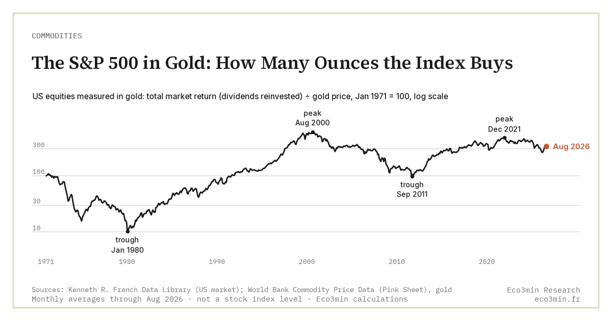
Priced in ounces of gold rather than dollars, the S&P 500 sheds its monetary component and keeps only corporate value. Measured that way, an index at a dollar record can look far less stretched than it appears.
TL;DR
Between late January and mid-June 2026, the S&P 500 rose to about 1.8 ounces of gold (S&P Dow Jones Indices closes, World Bank Pink Sheet gold), almost entirely because the metal fell nearly a sixth from its February peak while equities advanced.
- Measured in gold, US equities suffered a lost decade between 2000 and 2011 that the flat nominal curve hid: the market lost most of its real value before regaining it.
- The gold ratio works like the CAPE in reverse, where the CAPE deflates earnings for inflation, the gold ratio deflates price, both stripping the monetary illusion from a valuation read.
- Peaks coincide with positive real rates and equity risk appetite; troughs (1980, 2011) with low or negative real rates and demand for protection, making it a regime thermometer, not a directional signal.
The S&P 500/gold ratio, traced over long series, reveals valuation cycles the nominal price conceals. What it illuminates, and above all what it does not say, is worth setting out.
Pricing an index in gold, not in dollars
An index level quoted in dollars answers to two distinct forces. The first is the value of the companies it contains: their earnings, their capacity to invest, their competitive standing. The second is the value of the currency in which those companies are denominated. When the dollar loses purchasing power, an index can rise in nominal terms with no real value creation behind it. For the broader picture: the inflation-adjusted commodity price history.
Expressing the S&P 500 in ounces of gold removes the second force. Gold pays no coupon, has no issuer and depends on no monetary policy: it supplies a unit of account whose global quantity changes slowly. The S&P 500/gold ratio thus measures how many ounces the index buys at a given moment. Built on Robert Shiller’s monthly series for the index and the LBMA fix as a monthly average (World Bank Pink Sheet) for the metal, it reaches back to 1971, the year the dollar gold convertibility ended.
The logic is a change of numéraire. The question is no longer how many dollars the market is worth, but how much monetary metal must be given up to own it. The answer traces a path very different from the familiar nominal curve. Companion analysis: the structural signals embedded in physical commodities.
The yardstick is not perfect. Gold’s own purchasing power fluctuates: its real price has varied widely across decades, so the measure captures equity value relative to the metal, not against an absolute constant. Over a long horizon, though, gold holds its purchasing power better than most fiat currencies, which makes the ratio a useful corrective to nominal erosion, if not an immutable ruler. Related coverage: gold as a bet rather than insurance.
A half-century of waves: 1980, 2000, 2011
Read across fifty years, the series describes long swings. In the early 1980s, with gold peaking after the second oil shock and US equities stagnant, the ratio touched its historical floor: a fraction of an ounce then bought the index. Twenty years on, the equity euphoria of the late 1990s drove it toward its historical peak at the turn of 2000, as the S&P 500 brushed its highs of the era. Gold then traded near $280 an ounce on an annual average (World Bank Pink Sheet). The wider context: the details behind two near-twin S&P 500 ETFs.
The move then reversed. After the 2008 financial crisis and gold’s climb to $1,772 on a monthly average in September 2011 (World Bank Pink Sheet), the ratio fell below one ounce: the whole index was then worth less than an ounce of gold. These turning points do not show up on the dollar curve; they appear only once the erosion of the unit of account is stripped out.
The following decade saw the pendulum swing back. Carried by an equity market that clearly outpaced a gold price first in retreat then long range-bound, the ratio recovered markedly in the second half of the 2010s. The metal’s surge from 2022, up to the 2026 record, compressed it again. These multi-decade round trips are the signature of a long-cycle indicator, little moved by short-term market jolts.
This reading extends the analysis of gold as a monetary signal, grounded in real yields and central-bank demand. The ratio is its equity-side mirror: it places corporate valuation in the same yardstick used to gauge the metal.
The 2026 record market, measured in metal
Applied to the present, the gap between the two measures comes into focus. In mid-June 2026 the S&P 500 stood in all-time-high territory in dollars. Gold averaged $4,228 an ounce over June, after a monthly record of $5,020 in February 2026 (World Bank Pink Sheet). The daily London fix had peaked on 29 January. Against the metal, the index therefore buys roughly 1.8 ounces, based on closes published by S&P Dow Jones Indices, and the reading holds at the end of September 2026.
That level sits far below the 2000 peak, where the index was worth several times as many ounces. An equity market at its nominal high stands, in the gold yardstick, far below its historical extreme. Part of the indices’ nominal performance since the turn of the century reflects less real value creation than the gradual dilution of the unit in which that value is expressed. Measuring that dilution directly means putting the metal against the money stock: the gold price divided by US M2, monthly since 1960.
The first half of 2026 illustrates this double edge concretely. In late January, at gold’s daily record, the US index, already close to its dollar highs, bought markedly fewer ounces than in mid-June. Between its February monthly peak and June, the metal shed nearly a sixth of its value while equities advanced, and the ratio climbed to around 1.8 ounces. The rise reflects no re-rating of companies: it comes almost entirely from the falling denominator.
The reframing usefully complements long-term equity valuation as captured by the CAPE, which adjusts earnings for inflation over ten years. Where the CAPE deflates profits, the gold ratio deflates price: two converging ways of removing the monetary illusion from a valuation read.
What the ratio tracks: monetary and real regimes
Placed over the long run, the ratio’s highs and lows are not random: they largely follow real-rate regimes. The peaks — the late 1990s foremost — coincide with periods of disinflation, clearly positive real rates and strong equity risk appetite, a setting in which a yieldless asset like gold loses relative appeal.
The troughs describe the opposite picture. The 1980 floor caps a decade of high inflation; those of 2011 and the 2020s accompany phases of low or negative real rates and monetary stress, during which demand for protection underpinned the metal. The ratio then behaves as an indirect thermometer of the macro regime in which both assets move at once.
This kinship is nothing mechanical. It ties the ratio to the same reading grid used for the metal alone: the gold price responds first to real rates and monetary distrust, and it is this shared sensitivity that gives the equity/gold ratio its cyclical shape. Reading the ratio thus amounts to observing, from another angle, the same backdrop of monetary policy and inflation.
The nuance matters for interpretation: the same ratio level can correspond to very different regimes depending on whether it results from expensive equities and cheap gold, or the reverse. The level alone does not say which of the two assets drives the move; only examining both legs together, set in the macro context, reveals it.
What the ratio does not settle
The lens has clear limits. The ratio predicts no reversal: it describes a relative state, not a future path. Above all, its moves are double-edged. A rise can mean equities advancing faster than the metal, or the metal falling faster than equities; a decline, the reverse. The denominator moves as much as the numerator, and gold ranks among the most volatile assets, as its retreat of nearly 16% on a monthly average between February and June 2026 (World Bank Pink Sheet) underlined.
The measurement gap is paid in perceived performance. An investor who had counted equity wealth in ounces of gold rather than dollars would have lived through, between 2000 and 2011, a long erosion where the nominal curve showed only stagnation: measured in metal, the market lost most of its value over that decade before winning it back. The observation implies no preference for either yardstick; it simply recalls that the choice of numéraire radically changes the reading of one and the same equity history. A complementary angle: the trade-offs across gold access methods.
Part of market commentary reads every nominal record as a sign of overvaluation. The ratio invites a finer distinction: it separates nominal price from real value without settling the question of absolute richness, which depends on earnings, rates and risk premia. Reading a trough in the ratio as an equity discount would ignore that it may chiefly signal a passing strength in the metal.
The same principle of opposing two real assets structures the relationship between gold against cyclical copper. Set within physical commodity markets, these cross-asset ratios form a family of regime indicators rather than allocation signals.
Reading a high or low in the S&P 500/gold ratio as an entry or exit signal mistakes a relative gauge for a directional cue. The ratio combines two volatile prices: the same level can stem from equity strength or metal weakness. It locates a valuation regime; it triggers nothing.
A secular lens, not a signal
Pricing the S&P 500 in gold replaces no other valuation read: it adds one that is robust across monetary regimes, where an index’s nominal level blends corporate value with the value of money. Over half a century, the ratio is a reminder that a record in dollars is not necessarily a record in real value.
Its reach is first that of a framing. By removing monetary dilution, the ratio keeps a nominal peak from being mistaken for a peak in value, and resets each record within a long history where equities and the metal alternate as vessels for savings. It is a regime marker, to be handled with the same caution as any backward-looking read.
Several paths remain open: the ratio could keep rising if gold extended its 2026 retreat, or fall back if the metal regained its highs. None of these outcomes is written into the series. Its worth lies in what it offers, a long perspective on equity valuation set alongside reading the metal through real yields, not in a forecasting power it has never had.
Last updated — 6 October 2026
Disclaimer – Financial and Legal Information: The analyses, commentary, and content published on eco3min.fr are provided for informational and educational purposes only. They do not constitute investment advice or a solicitation to buy or sell financial instruments. Past performance is not indicative of future results. All investment decisions involve risk and are the sole responsibility of the reader. Data, charts and calculated series are provided as is and may contain errors or lag behind their source: check any figure against the primary source cited before relying on it. Content describing laws, regulations or contracts reflects the law as of its publication date and does not constitute legal or tax advice; applying it to a specific situation requires a qualified legal or tax professional.
Read next
Full pillar →Gold as a Monetary Signal: Real Yields, the Dollar and Central Bank Buying
Gold prices do not track inflation: they track the monetary opportunity cost of holding, itself driven by real…
Pure-play refiners versus integrated majors: downstream margin exposure
A pure-play refiner owns only the downstream, so its earnings track the refining margin. An integrated major also…
Jet fuel, the forgotten margin: the jet crack and the aviation link
The 3-2-1 crack spread reduces the refining margin to two products, gasoline and diesel. Jet fuel sits outside…